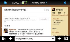
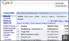
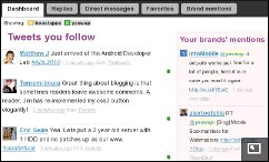
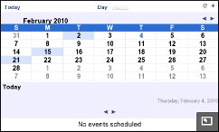
Using the N900’s MicroB browser is really an eye opener. The combination of a relatively large screen, 800×480 px resolution, very good JavaScript performance and full desktop Flash is turning my my mobile browsing pattern upside down. When I use Opera Mini on an N95 or the Android browser on the HTC Magic, I typically spend 75% of my time on mobile sites and the rest on “full” web sites. With the N900 it’s more like 50/50 and the percentage of desktop sites is rising as I find more and more that deliver deliver a richer browsing experience on the N900 than their mobile equivalents. The screenshots are a representative sampling of how desktop sites look on the N900. Click the thumbnails for to see the images in their original 800×480 glory.
The N900 reinforces something that I’ve long believed would eventually happen, the merger of the mobile and desktop webs. This doesn’t mean that users will simply switch from using mobile sites to desktop ones on their phones. Rather it marks a fundamental difference in the way that we look at the web and mobile devices. Going forward, web designers, developers and publishers will need to take into account that a rapidly growing percentage of their users will be visiting their “desktop” sites with phone browsers.
It’s not just a matter of tweaking the CSS and layout of desktop pages to ensure that they render attractively and are usable on mobile devices. Having a significant percentage of mobile visitors means taking into account the different needs of mobile visitors and their device’s extra capabilities. As Tomi Ahonen has been pointing out for years, mobile phones are actually more rather than less capable and powerful than PCs. Tomi has identified 10 “C”s (capabilities) of mobile phones, several of which are especially relevant to the web sites and web services. What Tomi calls Context (where, when and what) Charging (seamless payment), Community (social networking) and Creation (citizen journalism, micro blogging, photo and video sharing) are four that stand out. As mobile users flock to desktop sites, publishers and designers need to enable these special mobile capabilities to the highest degree possible. For example:
- The desktop sites of bus, train or rapid transit services must take into account the time of day and the user’s location when providing route and schedule information.
- Local shopping and services search engines should emphasize what’s near me and open for business now.
- eCommerce sites and payment processors need to exploit the phone as a payment device. It shouldn’t be necessary to key in 10 different bits of credit card information in order to buy something using your phone.
- Social networking sites have to ensure that all their services, especially text, photo, video sharing, are available and usable when mobile.
- News gathering organizations have a huge opportunity to effectively use the mobile citizen journalists’ ability to be on the scene of a breaking story with commentary, photos, videos and audio.
Does all this mean that the mobile web as we know it is going away? Yes, eventually I believe it will. But that time is several years away. The N900 is a harbinger of the future. It alone of the phones I’ve used delivers a near desktop browsing experience. Others come close like the the Nexus One and Droid/Milestone. They match the N900 in screen size and resolution but not JavaScript or Flash performance. The iPhone with its lower resolution screen and lack of Flash is not even in the same class.
At the moment the N900 is a bit of a niche device. It represents the next generation of mobile browsing but has minuscule market share. For the foreseeable future the vast majority of web access will be with less powerful devices. This is true in the developed world and especially in the developing one where slow, expensive data and a preponderance of low-end and very old handsets mean a continuing need for lightweight web sites. I believe that traditional mobile web traffic will continue to grow for a long time thanks to a sort of trickle down effect that will occur as high end devices make mobile browsing acceptable and fashionable combined with the trend to include unlimited data with the cheap unlimited voice, text and data plans that US prepaid providers like Straight Talk and Boost Mobile are offering feature phone users.
If anything the rise of phones that can browse like PCs means more rather than less work for publishers and designers. Not only do they have to build, enhance and maintain traditional mobile sites to exploit growing mobile traffic but they have to work to ensure that their desktop sites meet the needs of advanced users. No matter how you look at it the web is going mobile.

Pingback: WapReview.com: A Resource For Mobile Browsing « The Mobile (Web) Strategist
Pingback: The most user-friendly Maemo yet? | Open attitude.
I was able to open http://www.cnbc.com on my N900 in the same format like on my laptop. But in the past few days when I type in the url http://www.cnbc.com it now takes me to the mobile version and I don’t like that.
do you know How I can get the desktop browsing back to cnbc.com web page??
http://classic.cnbc.com/ works for me.
Pingback: The N900: A pocket PC « WOMWorld/Nokia
Pingback: Carnival of Mobilists #210 at WIP Jam Sessions – Connecting Developers
Does services using Java work alright on N900?
There is no Java support currently.
it looks like you won’t be returning n900 back :D
I wish!