DW-WORLDContent 


 Usability


 Deutsche Welle
 or 'DW' is Germany's independent but publicly funded international broadcaster. Somewhat similar to the BBC International Service or the Voice of America, DW broadcasts shortwave radio news, sports and cultural content in 29 languages and satellite TV in four; English, German, Spanish and Arabic. Like the BBC, DW has a comprehensive internet site,
DW-WORLD.DE again in 29 languages. Of course I wouldn't be writing abour DW-WORLD unless they had an interesting mobile web site. The mobile site is
mobile.dw-world.de and it features almost all of the content from the full web site in different 29 language editions .
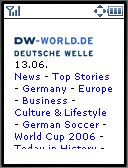
The mobile site not only contains most of the articles on the full web site but the articles are also complete, although that's not too hard as DW-WORLD articles tend to be short, averaging 400 words. Most articles are illustrated with a single photo 122px wide. Page weight is mobile friendly, about 7 KB for text and image combined. The UI is reasonably good with a text based navigation menu at the top of the main pages, followed by short headlines linking to the stories. There is some room for improvement, the navigation menu has too many links and fills the first screen and half of the second on a 128x160px device. I'd also like to see access keys on the navigation links and the "To Top" link at the bottom of the page, but it's a very usable design as it stands.
 Deutsche Welle or 'DW' is Germany's independent but publicly funded international broadcaster. Somewhat similar to the BBC International Service or the Voice of America, DW broadcasts shortwave radio news, sports and cultural content in 29 languages and satellite TV in four; English, German, Spanish and Arabic. Like the BBC, DW has a comprehensive internet site, DW-WORLD.DE again in 29 languages. Of course I wouldn't be writing abour DW-WORLD unless they had an interesting mobile web site. The mobile site is mobile.dw-world.de and it features almost all of the content from the full web site in different 29 language editions .