Bloglines
bloglines.com/mobile/ (HTML5)

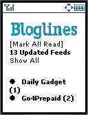
 Bloglines is a great web based aggregator on the desktop. It has a lot of potential as a mobile browser. Unfortunately, Bloglines Mobile has one critical flaw - it lacks an item index page. By index page, I mean the list of items for an individual feed. Index pages provide a drill-down capability that is essential to managing the volume of information in an RSS feed on a small screen. To me, a mainstream phone has a 128x160 pixel screen. Sure, smartphones have at least 176x208 and feature phones like the RAZR are starting to use that size as well. But most Nokias have 128x128 screens and the entry level Nokias are only 96x65. If you want your site to have mass appeal you have to aim at the mass market devices. The first image in the Winksite review shows an example of an index that works on small screens. Feedalot and Bloggo use the same design. Bloglines dispenses with an index page altogether and dumps you into the full text of all of a feed's current entries one after another as one giant page To get to the second entry you have to scroll through the full text of the first entry. That could easily be 15 screenfulls on a 128x160 phone. That's OK if you sequentially read though every post in every feed you subscribe to, but I read far too many feeds for that. I want to be able too scan the entry titles and read the ones that sound interesting and then maybe go back to the titles and read a couple more entries that sound interesting. Blogline's design might works on something like a Treo, Danger Hiptop/Sidekick or Nokia 9300 which has a large screen and dedicated page-down keys. If that's the target device, fine. But those aren't the mainstream phones that predominate today on the mobile web.
In spite of the above criticisms, I use Bloglines every day. Why? In a word - synchronization. I want my mobile reader to only show me items I haven't read already on the desktop and vice versa. Along with a million or two other folks, I use Bloglines on the desktop, it's simply the best aggregator around. As I said above, the problem with Bloglines Mobile is that it shows all the unread items for a feed on a single page. This doesn't work well with commercial feeds like Slashdot or Engadget which have dozens of new items daily. But Bloglines allows you to specify which of your feeds you want to see on your mobile (It's under Edit Subscription on each feed's index frame in desktop Bloglines). I set up Bloglines to just display sites on my mobile that only update every day or two (like most personal blogs). It turns out that these are the sites I tend to really read most of the articles instead of just scanning the titles to see if there's anything interesting. So when I'm on the train I read through all the items posted by a few of my favorite bloggers on my phone. When I'm back at my desktop, I skim through the busy commercial sites.
Note: if you are using the WAP1 version of Bloglines, you need to hit the Refresh link after logging before you can see your feeds. This is not a Bloglines bug, it's a limitation of the YesWAP html to wml transcoder.
Dec-2010: Bloglines was acquired by Merchant Circle who immediately shut down the mobile edition.
