
Orbitz Mobile
mobile.orbitz.com/ (xhtml-mp)
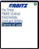 Justin over at MOpocket mentioned that online travel giant Orbiz has launched a mobile site and added " I hope WAP Review guy does a review of it". I'm happy to oblige, so here goes.
According to Alexa, Orbitz.com is the number two (in web traffic) online travel agency behind Expedia. In terms of mobile web adoption Orbitz also trails Expedia whose UK operation has had a wml-only Web site for several years. The new Orbitz site is much nicer than Expedia's, however. Orbitz Mobile (mobile.orbitz.com) features a simple, intuitive interface, good for today's harried travelers. The site restricts itself to just four functions.
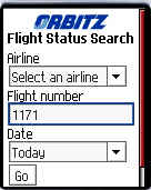
- Flight Status for 27 airlines from around the world including many that do not have their own mobile site. Notably absent are US low fare carriers Jet Blue and Southwest.
- My Trips, which lets you view itineraries that you have booked on Orbitz.
- Find Hotels, which lists hotels with current availability in 19 major US cities plus Cancun, Mexico.
- Contact Orbitz with click to call links to Orbitz US 800 and international phone numbers.
There are mobile travel sites with more features than Orbitz but few if any that are as easy to use. The interface isn't flashy but it's clean, uncluttered and intuitive which counts for more with me than flashiness. Accesskeys are used liberally speeding navigation.
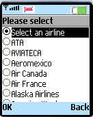 There is one negative aspect of the user interface that I've criticized before on other sites A dropdown list (html select) is used to choose an airline on the flight status page. With 27 airlines in the alphabetical list that's a lot of clicking the D-pad down arrow on a typical handset - particularly if your airline is United or Virgin Atlantic. I'd prefer a GUI using only accesskey enabled links in a drill down. Meaning, the user first picks a range of letters 'A-E', 'F-H'... and gets a new page with only airlines matching the selected letter range. If you do it right and you don't have more than 100 airlines to choose from it only takes 2 clicks to select any airline. It does mean an extra page load and round trip to the server and back but that still beats all those clicks. The drop down only needs a single page load which can be faster (but with more total bytes transmitted) but requires a minimum of n/2 + 2 clicks where n is is the number of items in the list. On Obitz Mobile that's an average of fifteen clicks for something that could be accomplished with two. It's a trade off and may not matter depending on the phone. With a touch screen device the drop down wins but on a typical phone the links are faster. My latest phone scrolls quickly and the D-pad needs only a light touch so I'm less bothered by long dropdowns than I used to be but I still think it's a poor mobile design.
The Orbitz site loads quickly. The fast load times are partially a function of the small page sizes but web server capacity plays a part too. Over the last year, I've noticed that several of my favorite mobile sites have become so slow as to be almost unusable. I take this as an indication that the mobile web is becoming more popular. Content providers need to monitor response times and make bandwidth upgrades before users notice a slowdown. Nothing drives users away faster than slow page loads and timeouts. Orbitz Mobile is new so the speedy response may not last as more users discover it but for now it's a great choice for flight status on the go.
 I'm less impressed with the Hotel Search. It's not really an interactive search, you pick one of the 20 cities and get a list of five hotels in each city that have availability for tonight. To actually book a hotel you have to call Orbitz - at least it's a click to call link. I guess that's in keeping with "keep it simple philosophy" Still allowing you to specify a date range, while still defaulting to tonight and listing more than five hotels in the results would add value without detracting from usability.
