Wikipedia Mobile
m.wikipedia.org (xhtml-mp)
 Wikipedia's official mobile site. How does it compare with Wapedia, my favorite Wikipedia mobile front end?
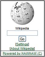
Both have a simple homepage dominated by a search box, not unlike what you see when you visit Wikipedia on a PC. Wikipedia Mobile gets points though for including the classic Wikipedia "puzzle globe" Iogo on the front page.
For a real test, I tried looking up "Tokyo" on both sites. The Wikipedia Tokyo page is big (814 KB) with many images and some double byte Japanese characters. It's a tough test for mobile front ends.
Both sites were up to the task of displaying the Wikipedia Tokyo page on mobile devices. Pages were split and images resized so that everything fit both with into physical screen dimensions and the memory limits of a variety of handsets. The double byte characters were passed though unaltered, they look like gobbledygook on most western handsets but will display correctly on phones with Japanese language support.
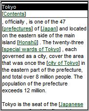
Overall I preferred Wapedia's presentation Some of the original page's content was missing in Wikipedia Mobile. Particularly noticeable was that the first few words of the article were missing so that the piece started with a comma! (2nd image) A table near the top of the page listing Tokyo's population, area, symbol, flower and other basic facts also did not appear in the Wikipedia Mobile version of the page.
 Another thing I liked about Wapedia is that it has a more fine-grained algorithm for spliting pages and resizing images. Wikipedia resizes all images to a maximum of 128 px regardless of the phone's actual screen size, Wapedia alters maximum image width anywhere from 91px wide for the Nokia 6230 to 310 px wide for the iPhone or G1 which is certainly desirable unless you like squinting at tiny pictures. The same is true of pagination, Wikipedia Mobile uses two fixed pagination sizes, the Tokyo page is split into either 30 pages for WML-only phones or 18 pages for modern devices. Wapedia dynamically adjusts page size to fit handset memory. The N95 sees the Tokyo article in 9 pages while an old wml-only Motorola i85 gets 60 much smaller pages. Not only is Wapedia more likely to work on low memory phones but it's a lot faster and less annoying to press "Next..." nine times than 18 on a more capable phone.
One advantage of Wikipedia Mobile is that it's ad free, Wapedia has advertising, although it's pretty minimalistic, just a single text link at the top of each page. I hardly notice the ads, but if the thought of advertising on Wikipedia content bothers you, try Wikipedia Mobile.
Personally I plan on continuing to use Wapedia. But it's good to have alternative ways to get at Wikipedia's great content from handheld devices.
