Twitter Mobile
m.twitter.com (xhtml-mp)
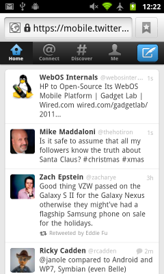
Twitter mobile web app looks and feels much like the Twitter Android and iOS apps. It looks gorgeous, I've got to give credit to Twitter's designers for that. Will I be using it? Probably not that much. I'm a big fan of the "old" editabe re-tweet, which Twitter discourages. Traditional editable retweets are still availble in the iOS and Android versions of the Twitter web app in the form of the "quote tweet", which is essentially an editable re-tweet except that instead of using the "RT" convention, it wraps the original tweet in quotation marks. On other platforms including Windows Phone, Opera Mini and Synbian the editable retweet is nowhere to be found.
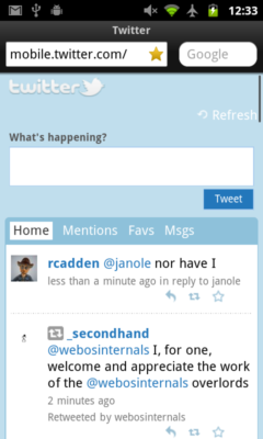
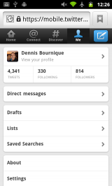
There are some some pretty big paradigim shifts in the new design. The old "Mentions", "Favs" and "Messages" tabs are gone, replaced by "Connect", "Discover" and "Me".
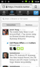
- "Connect" combines other users interactions with you; new followers and old and new style re-tweets.
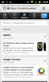
- "Discover" has the search box plus the top trending hashtag and most retweeted link.
- "Me" is your profile, including your tweets, DMs, Drafts, Lists and Saved searches.
I think the new organization generally makes sense, although it will some getting used to. However there are two areas where I think the new Twitter is harder to use than the old, DMs and hashtags.
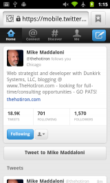
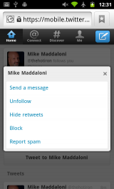
- DMs are now buried on the "Me" tab rather than having a tab of their own. The DM button on friend's profiles is gone too. Instead there's a "Send A Message" option hidden behind the "following" dropdown on profiles. Not very intuitive. Before you could tap a friend's handle in your timeline to quickly DM them. Now it takes several additional taps.
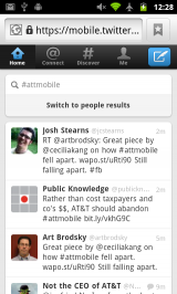
- Using hashtags as event back channels is also less convenient. In the old Twitter you could tap a hashtag in any Tweet to bring up a time line of all Tweets with that tag. The tweet box was prefilled with the tag so you could easily join the conversion. Now you have to go to "Discover" and search for the tag to see the Tweets. And you have to re-type the hashtag everytime you want to use it in a Tweet of your own.
In summary, the new mobile Twitter Web app looks good. It seemed quick and smooth on my Nexus S 4G. But with lack of editable re-tweets on some platforms and serious usability issues around hashtags and DMs I think I'll stick with Dabr.com.
