PandoDaily
pandodaily.com/ (HTML5)
Founded in January, 2012 by former TechCrunch reporter Sarah Lacy, PandoDaily has quickly grown to be one of the top news sites covering Silicon Valley and the startup scene.
Like virtually every other news site and blog in the world, PandoDaily is built with WordPress. Unlike the majority of WordPress sites, Pando uses a Responsive Web Design inspired custom theme that adapts on the fly to mobile, tablet and PC browsers.
The design, by Sara Cannon generally works well. As the browser viewport gets smaller, PandoDaily's signature "Ticker" timeline of breaking news mini-posts moves from the sidebar to below the main content. At the same time, the five column "Week in Review" footer reformats as a single column to fit smaller screens.
In my testing, PandoDaily looked good and worked well in the Android and iOS browsers, Opera Mini and Mobile, Firefox Mobile and Nokia's S40 Xpress browser, across viewports ranging from 1680px to 128px in width. However, the site's 3MB page weight will not be appreciated by users who pay for data by the KB.
Screenshots:

Slashdot
m.slashdot.org/ (HTML5)
Slashdot is a venerable (founded 1997) user powered tech and politics news site, which was recently acquired by Dice.com. Slashdot stories, as well as polls, questions and book reviews, are submitted by users. Other users can vote stories up and down and leave and rate comments. Randomly selected user moderators can label stories and comments as interesting, informative, off-topic, flamebait, etc. Stories are primarily assigned to the front page by Slashdot editors rather algorithmically.
The current mobile version of Slashdot has Stories, Polls and Firehose tabs but no UI for accessing Slashdot's tags or categories. If you don't like the mobile webapp, there's a link to the Desktop version in the mobile page footer.
Slashdot Mobile is optimized for iOS and Android browsers. It also works well in the Firefox and Opera Mobile browser but not in Opera Mini, where only a blank page is displayed. There's a legacy text-only mobile version that works in all browsers at slashdot.org/palm/.

Slashdot Text Only
slashdot.org/palm/ (HTML5)
The famous and popular "News for Nerds" site in an ultra-light format. Links to non-handheld friendly pages.

ReadWrite
readwrite.com/ (xhtml-mp)
Popular tech blog ReadWrite (formerly ReadRightWeb) is one of latest and largest web properties to replace it's separate mobile and desktop sites with a slick responsive design intended for both desktop and smartphone browsers. The new design works reasonably well in both although the fixed position sidebar jumps around annoyingly in desktop Firefox and images and text overlap badly in portrait orientation in the Windows Phone 8 browser.
The site's front page is about 1700 KB (1100 KB compressed) in size (individual item pages are generally smaller). It's usable with proxy based feature phone browsers like Opera Mini and Nokia Xpress but is too large to load in most embeded feature phone browsers. The large page size will also be a concern for users who pay for data by the KB or MB. The old ReadWriteWeb mobile site displayed the desktop edition's full editorial content, including images and comments in about 100 KB.
ReadWrite, which has been around since 2003, specializes in news and analysis of web sites, web based services and web technology with an emphasis on social media and mobile.

Wired
m.wired.com/ (xhtml-mp)

Wired magazine's slick new mobile site features most of the content of Wired.com in a very attractive touch mobile format that takes some of its design cues from the magazine's acclaimed (and pricey) iPad app.
The one size fits all page design manages to look and work well with the iPhone, Android, Symbian, Opera Mini and Opera Mobile browsers. The 170 KB front page size might be too much for some feature phone browsers, however.
My only real complaint is that the many, great videos of the iPad and full web editions don't seem to be working in the mobile web version. An embeded player is defined in the code but no player appears in the Android, Symbian or bada browsers. On the other hand, the site's banner ads don't seem to be displaying either, so I really can't complain much.

paidContent
m.paidcontent.org/ (xhtml-mp)

Although it's been around since 2007, I just discovered the mobile edition of paidContent.org, a leading tech news site covering digital media including entertainment, publishing, advertising, marketing, and technology.
Founded in 2002, Paid content was acquired in 2008 by the UK's Guardian Media Group, publisher of The Observer and Guardian daily newspapers.
The mobile edition has a clean attractive design that echoes the style of paidContent's desktop site. it's a one size fits all design that looks and works well on Android and the iPhone but degrades nicely to be usable with the most basic of mobile browsers. There are few images, other than a logo, and no ads either. Page sizes are admirably small (the front page is only 15 KB). Most news items are short but there is no pagination of longer articles which can be as large as 56 KB. There's no image resizing either and images, while few, tend to be large
paidContent has three sister sites that use the same mobile template: m.paidcontent.co.uk and m.contentsutra.com which are the UK and Indian editions of paidContent.org and m.mocoNews.net which covers mobile media.

GigaOM
gigaom.com (xhtml-mp)
 GigaOm is on my short list of must read tech blogs. Founded in 2001 by veteran technology and business journalist Om Malik (Red Herring, Forbes, Business 2.0) it has grown to become one of the most widely read online journals covering the business of the web and technology. Om, who is one of the most knowledgeable analysts in the industry and a great interviewer, has assembled a team of first-rate writers for the site including Kevin C. Tofel, who specializes in mobile.
I recently followed a link to a GigaOm piece in Opera Mini and landed on a new mobile version of the site. I liked the way it looked so I dug a little deeper and I discovered that GigaOm, which is published on WordPress.com, actually has two mobile versions. Basic browsers, a category which apparently includes the Symbian^3 and bada browsers - sorry Nokia and Samsung!) get the same generic Alex King designed mobile template as other Wordpress.com hosted sites. But the iPhone, Android, WebOS and Opera Mini are served a customized version of WPTouch. Whoever designed it did a nice job of adapting GigaOm's branding and color scheme to mobile media. The addition of a thumbnail image for each post and the elimination of the heavy borders of the default WPTouch layout has made the design a lok more inviting and modern looking to my eye.
Before anyone asks, GigaOm Mobile is served to supported browsers from the usual gigaom.com URL. There doesn't seem to be a way to force the custom mobile layout in browsers that don't get it by default.

Engadget
m.engadget.com/ (HTML5)
One of my favorite tech news sites, AOL's engadget.com, recently started forcing Opera Mini users to a new mobile version of the site that looks like it was designed for legacy dumb phone browsers (image). I could live with the boring plain text on a white background, but not with the severely degraded and distorted images. But the worst part of the new design is the pagination, which breaks most articles into multiple tiny pages. Even on dumbphones, Opera Mini can load extremely large pages, so the pagination is completely unnecessary.
The way Engadget looks and works in Opera Mini annoys me so much that I created an Opera Mini bookmarklet to sort of fix it. Click here and follow the instructions on that page to install the bookmarket. When you land on one of the paginated Engadget mobile pages, go to you bookmarks and click the bookmarklet and the desktop version of the same page will load.

TechCrunch
techcrunch.com/ (xhtml-mp)
One of the top tech web sites covering startups, gadgets and the web,

The Verge
mobile.theverge.com/ (xhtml-mp)
Former Engadget editor in chief Joshua Topolsky's new tech news site, The Verge, went live Nov 1st.
I'm happy to report that The Verge has a nicely done mobile version. Based on Vox Media's proprietary publishing platform The Verge's mobile edition features a mini-slideshow at the top of the homepage. Thankfully the sideshow is not automated. Below it are thumb-nailed links to recent posts in chronological order followed by a topic menu. Individual posts are presented as a single page without unneeded pagination and include all the images and videos from the original post.
The mobile version works well with current smartphone browsers including the Symbian and Android browsers as well as Opera Mini. With page sizes hovering around 400 KB it's not well suited for typical feature phone browsers.
There are a couple of areas for potential improvement. There's no site search in the mobile version and the "dots" to go to the next image in the lideshow are too small to hit reliably using touch.

Gizmodo
m.gizmodo.com/ (xhtml-mp)
The mobile edition of Gawker Media's tech and gadget site, Gizmodo includes the full text of recent posts with images resized to fit screen dimentions. Coments are included but it's not possible to leave a comment.

TechnoBuffalo
www.technobuffalo.com/ (xhtml-mp)
Launched in 2009, TechnoBuffalo has grown quickly to become one of the top US-based tech blogs. It features tech news, reviews, tech tips and lots of videos.The attractive mobile view, a custom Wordpress theme, includes all the site's content, including the videos. It works well in smartphone browsers and Opera Mini.

PC Magazine
mobile.pcmag.com/ (xhtml-mp)
News, reviews and columns from PC Magazine's website. Full text of articles but no images. Produced by mdog

JAXenter
jaxenter.com/ (xhtml-mp)
JAXenter provides Java Developers and Software Architects with the latest news, videos and events on Java, Enterprise Architectures and SOA.

ZDNet Blogs
m.zdnet.com (xhtml-mp)
 ZDNet, the online tech news, reviews and software download site, also hosts a network of around 45 blogs including several well known and popular ones like Mary Jo Foley's All about Microsoft and Adrian Kingsley-Hughes's Hardware 2.0. There's a list and links to all 45 on the Blogs tab of the ZdNet Homepage. I knew that at least one ZDNet Blog, Matthew Miller's The Mobile Gadgeteer, had a mobile edition and it turns out that all of them do.
There's a mobile front end at m.zdnet.com which lists and links to the most recent posts accross all 45 blogs. When you go to www.zdnet.com with a mobile browser you are redirected to m.zdnet.com. This happens even if you're using a full web browser like Opera or Nokia WebKit. Of all mobile browsers, only the iPhone escapes this forced redirection. There doesn't seem to be any way to tell ZdNet that you want the full version on your mobile. The problem is that only part of ZdNet.com is mobilized and these full-web mobile browsers could easily display the parts that aren't. All that's needed is a link, something like pc.zdnet.com that bypasses browser detection to go directly to the full ZdNet site. More...

The Next Web
thenextweb.com/ (xhtml-mp)
The NextWeb is a news blog focused on the web services and technology. The main blog is divided into numerous subject area, brand and geographic specific channels like Apple, Google, Social Media, US, UK and Asia.
Curiously, the mobile version of NextWeb (created with WPtouch) is delivered only to iPhones, Android and WebOS devices and Opera Mini. BlackBerrys, dumb phones and Symbian devices get the 600 KB desktop version, which they are unlikely to be able to load, instead of the 70 KB mobile one!

Ars Technica
arstechnica.com/ (xhtml-mp)

Ars Technica which is Latin for "art of technology" is a big tech news site covering computing, science and gaming with breaking news items and in depth articles.
The recently launched Ars Technica mobile edition includes most of the full site's content including its dedicated Apple, Microsoft, Open Source, Gaming, Business and Tech Policy sections. The only part of the site that isn't mobilized is the forums which unfortunately is where the comments on articles are.
The site's modest 25 KB page size means that it should work with most mobile browsers. Pages are formatted to fit 320px and wider screens so horizontal scrolling will be needed on many devices. A curious omission is that there are no navigation links to several of the news sections including, surprisingly for a mobile site, the Telecom section. The missing sections do have mobile versions but the only way to reach them seems to be by keying the section's URL like arstechnica.com/telecom/

Techdirt Lite
techdirt.com/index_lite.php (HTML5)
 Techdirt is Mike Masnick's blog covering technology and media. Mike's a very good tech business analyst, particularly in the areas of privacy and intellectual property and he's made Techdirt a hot property. It's on CNET's Blog 100 list, the Technorati 100 and lots of other "best of tech blogs" type lists. There's a "Lite" version (techdirt.com/in
Originally the front page contained the full text of the 20 latest articles - about 60 KB's worth. which meant that it was too big to load on many mobiles. But after I blogged about my concerns, Techdirt made some adjustments cutting the number of posts per page to 3 which reduced page size to only 10KB. The format of Techdirt Lite is rather cool, it's the simplest possible UI, just open the site, start reading and read until you've had enough. I don't think pagination hurts the reading experience, having to click on Next every 9000 characters or so is no great hardship considering it would makes the site usable on all mobile browsers instead of the 30/40% that could handle the 60KB version. A side benefit is much faster page loads, a real issue on slow networks.

Fast Company
m.fastcompany.com/ (xhtml-mp/wml)
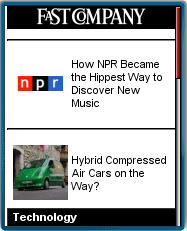
Fast Company is a print and online business magazine focused on technology, innovation and social responsibility. And now there's a mobile version of Fast Company at m.fastcompany.com.
The mobile web design, which is by Crisp Wireless, generally does a good job of resizing images and splitting up pages so that the site works on anything from the iPhone to old wml-only devices. A lot of mobile web development shops seem to focus on high-end devices and end up producing pages that won't even load on the feature phones that account for 70% of mobile web use according to Comscore.
I do have one beef with the mobile version of FastCompany. Where are the videos? FastCompany is probably best known on the web for its video interviews of tech luminaries by Robert Scoble. The videos are hosted on FastCompany.tv but linked to from the main site.
Scoble recently left FastCompany, reportedly after Seagate declined to renew its $1 million/year sponsorship of Scoble's show. It looks like video production at FastCompany has totally halted after Scoble's departure with no new videos released since March 5th. Video was such a major part of FastCompany's online content, I hope this doen't mean the end for fastCompany.tv. I'm also disappointed that the previously produced videos don't seem to be available in a mobile friendly format.

Lifehacker
m.lifehacker.com/ (HTML5)
 It looks like the hugely popular Lifehacker.com blog, which recommends time saving technology and techniques to make yourself more productive, now has a mobile site. The announcement is here. There is no mobile specific url, Lifehacker is using browser detection at lifehacker.com to deliver mobile content to phones - at least the ones it recognizes. I played around with feeding Lifehacker a dozen different mobile user-agent headers and Lifehacker delivered mobile content to the majority of them. The Ericsson T68 and Motorola V710 were not detected and got PC content. I strongly believe that mobile sites which use browser detection should also include a link to the mobile site at the top of their PC pages and another link to the PC site at the bottom of each mobile page so that users can override the browser detection if needed or desired.
The mobile Lifehacker pages are a bit of a mixed bag from the standpoint of mobile usability. All the text and pictures from the PC Lifehacker items are present which is good but the pages are on the heavy side for anything less than a smartphone. The front page contains summaries of 20 articles and 10 images for a total page weight of 100 KB. The mobile guidelines from the W3C, Luca Passani's GAP and dotMobi all recommend mobile pages under 20 KB and with good reason as popular phones like the GSM RAZR won't load pages much over 10 KB let alone 100 KB. At least the images on the mobile front page are resized to 120px wide. However once you leave the front page and go into the articles, you will run into larger images, as large as 475 px wide, exceeding the screen size of all but a handful of phones.
If you visit Lifehacker's mobile site with a smartphone, connected PDA or any phone running a full web browser like Opera Mini, page size and image size won't be an issue but a lack of features may disappoint. Many recent smartphones like the Motorola Q, Cingular 8125 and Nokia E61 have full QWERTY keyboards making commenting on blogs relatively quick and easy - but it's not possible to leave a comment or even view existing comments using the mobile Lifehacker site. Any of these full web browsers could do a credible job of rendering Lifehacker's full PC page but they can't reach the full site because the browser detection delivers the mobile edition.
Let me offer a life hack of my own for anyone wanting to enjoy Lifehacker on their phone in the most efficient and productive way - Google Reader. Lifehacker has a full RSS feed, set that up in Google reader and use the mobile edition of Reader to access it from the phone. Reader even lets you click through to a transcoded for mobile version of the original item where you can read the comments. Even with Reader you can't leave a comment, the Javascript driven Lifehacker comment form is too much for the Google transcoder.

Digg Mobile
digg.com/ (xhtml-mp)
With the "new" Digg there's also a new mobile interface. It looks nice but feels like a step backwards. Currently there's no way to log in and Digg or submit a link

TechRadar
m.techradar.com/ (xhtml-mp)
The UK's bigest tech news and reviews site's mobile edition includes all the desktop site's content in an attractive and easy to navigate format.

TrustedReviews
www.trustedreviews.com/ (xhtml-mp)
As the name suggest this is primarily a tech review site covering smartphones, cameras, video and audio gear and PC and peripherals. There's also an extensive tech news section.

Mashable!
mashable.com (xhtml-mp)
 Peter Cashmore's Mashable! is a high-traffic news blog covering social networking, web 2.0 and mobile.
I suspect the site's name comes from "Mashup" - combing two (or more) web services to create a new site or service - think of TwitterVision which combines Ttwitter feeds with the Google Maps API to show Twitter updates as text bubbles on a world map. Mashable does cover mashups, especially ones involving popular social networks. But Mashable is a lot more than mashups, with 20 or more news items a day, a MarketPlace section for job postings and Web 2.0 related services for sale or wanted and a page listing invites to startups in closed beta. There's also a daily podcast, usually with the founder or ceo of a hot startup. A popular feature of Mashable is Mashcodes a repository of free MySpace themes, games and plugins. And Mashable itself is a social network, with personal profiles, photo page friends, status updates and messaging.
On July 1oth, Mashable launched a mobile edition at m.mashable.com Unsurprisingly it's a mashup, using MoFuse to generate a mobile version of from RSS feeds of the Mashable's News, MarketPlace and Invites sections. MoFuse is used by a number of sites including ReadBurner and MobileActive (review). It's also one of the services I reviewed in 4 Easy Ways to Make your Blog Mobile Friendly. Since I wrote that piece, MoFuse has added a nicely formatted iPhone version. Another recent enhancement is image resizing, where images are reformatted to a maximum size equal to the screen width. That should make MoFuse pages compatible with more phones, but I'd like to see MoFuse implement page splitting too. As it is, the page delivered to mobile can still be quite large, one of the news items on Mashable today contains 17 KB of text plus 41 KB of images. That's no problem for any Smartphone and many feature phones but too big to display completely on something like a RAZR V3. The W3C and dotMobi generally suggest a maximum of 20 KB text (10 KB markup plus another 10 KB of images) for pages intended to work on any phone.
Mobile Mashable is a subset of the full site but a fairly complete one, offering the full content of the news, marketplace and invites sections. If you want to get to the full site and your browser can handle it, Mashable doesn't force mobile browsers to the mobile version, although if you use a PC browser to visit m.mashable.com, MoFuse displays the content in a mobile widget.

Fortune Tech
tech.fortune.cnn.com/ (xhtml-mp)
Fortune magazine's tech blog.
The mobile template is a vanilla copy of the free open source version of BraveNewCode's iPhonesque WPtouch plugin. But unlike the main Fortune mobile site (cnnmoney.mobi/primary/wk_mag_fortune) which is limited to 9 stores, this one is contains a continuous timeline of all Fortune tech articles organized by subject matter tags like Apple, Microsoft, Tablets and Patents.

Scientfic American
sciam.com/ (xhtml-mp)
Now you can read articles from the venerable popular science magazine on your mobile phone. SciAm's mobile site has several dozen complete articles from the magazine's full web site. Articles are paginated and images are resized resulting in a highly usable site that works well with any mobile browser.

PCWorld
www.pcworld.com (HTML5)
PCWorld recently repaced their separate deshtop and mobile sites with a single site built using responsive design principles. The new design reflows and reformats itself into a single column for narrow viewports including phones. The design generally works well although the layout is marred by desktop sized banner adds that aren't hidden or resized to fit the viewport. The design also doesn't reflow in Opera Mobile or Mini where it's render in full desktop layout.

Ogbongeblog
m.ogbongeblog.com/ (xhtml-mp)
Jide Ogunsanya's tech blog has mobile phone reviews, PC and blogging tips, iPad tutorials and more. Mobile version created with Mobstac.

Techmtaa
mobile.dudamobile.com/site/techm... (xhtml-mp)
Mobile edition of a a leading Kenyan tech news blog. The mobile view was created using dudamobile, a template based mobile site designer and hosted service that helps publishers create mobile versions of their sites without coding.

AfriGadget
www.afrigadget.com/ (xhtml-mp)
Bamboo laptop cases, generating biogas from cow manure; boats, airplanes and soccer balls made from recycled materials are just a few of the hundreds of the amazing creations found on Afrigadget, a blog celebrating the ingenuity of African inventors and tinkers.

@akumar overflow
b.akumar.me/ (xhtml-mp)
An interesting and mobile friendly blog from Amit Kumar , former product direct for Yahoo Search and founder and CEO of Lexity, an online marketing for small businesses startup. A self described hacker, Amit blogs frequently on topics ranging from web design to tech trends to iPhone apps. I especially especially his piece on Google's Search+ changes A layperson’s explanation of rel=nofollow: Twitter’s stuck, but Google’s being coy.

Techcraver
techcraver.com/ (xhtml-mp)
Techcraver.com is Jason Harris' blog covering mobile hardware/applications/platforms, hardware, software, web services, consumer electronics and other technology and how it affects people and society.
Jason is a solutions architect, developer and freelance writer whose content has been published by GigaOm, Web Worker Daily, CMSWire and WOMWorld/Nokia

Many Possibilities
manypossibilities.mobstac.com/ (xhtml-mp)
Steve Song's lively and frequently updated blog covers telecoms in Africa, open source and the societal impact oftelecomunications and the Web. The attractive mobile template is by MobStac. Source: Venture Capital for Africa

Skatter Tech
skattertech.com/ (xhtml-mp)
Sahas Katta (@sahaskatta) and team's comprehensive tech news and reviews site covers the world of gadgets, deals and the web with news, reviews, hacks, opinions and videos.

Geek.com
www.geek.com/portable/ (xhtml-mp)
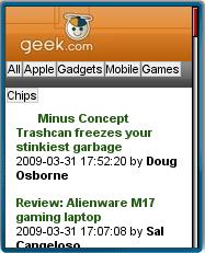
Long before Engadget and Gizmodo there was Geek.com. The tech news site has been around since at least 1998 and is still a good source of tech news. There even used to be a mobile version called PDAGeek that seemed to disappear a couple of years ago. It looks like it's back minus the dated PDA moniker in the form of this attractive and usable site. Geek.com's mobile site carries the full text of all the hundreds of items on Geek.com's PC site divided into categories including Apple, Gadgets, Mobile, Games and Chips. Page sizes under 20 KB insure that the site will work on almost any phone.

SlashGear
slashgear.com/ (xhtml-mp)
One of the top news blogs covering personal technology and consumer electronics, Slashgear now has a mobile edition. It's very full-featured and includes all the posts, comments,reviews, columnists and videos from the desktop version. There's no pagination and images up to 540 px wide make this a resource intensive mobile site with pages up to a megabyte in size.

Discover Magazine
m.discovermagazine.com/ (xhtml-mp)
Online edition of Discover Magazine, which covers science news, technology, space, environment, health medical and more. Mobile view by Mobify.

OS News
mobile.osnews.com/ (HTML5)
wap.osnews.com/index.wml (wml)
 OSNews is a web site that covers just about every operating system past and present. There are the expected articles on the latest Microsoft Vista delay, the backlash against the Intel Apple and new releases of various Linux distros, but to me the real heart of OSNews is it's coverage of obsolete and obscure OS's. It's a great site for anyone who has been playing with computers for a while and wants to know what's up with the old systems like Amiga or BeOS or even Apple II DOS these days. The site is also a must read if your are interested in upstart and underdog modern OS's like Syllable or SkyOS. OSNews strives to cover all operating systems including embedded, mobile and PDA OS's. There are quite a few mobile related articles. There's even coverage of mobile and PC browsers, which makes sense as browsers are now computing environments and performing many of the functions traditionally associated with operating systems.
To support their readers on a wide range of systems, OSNews has versions of their sites that are viewable on virtually any browser including mobile browsers. This page describes the support for numerous old, text-only and mobile devices. Using browser detection, OSNews will deliver one of four different versions of the site.
1) The normal web version at http://www.osnews.com/ with advertising and large images, formatted for modern web browsers with horizontal resolution of at least 640px.
 2) A lighter but still full featured cHTML version for most other browsers including text-only browsers like Lynx, older graphical desktop browsers like NCSA Mosaic, PDA browsers and most mobile browsers (first two images). This version contains almost all the content of the web version including the full text of all the News, Features, Interviews and Editorials sections. On mobiles the site will display without horizontal scrolling on any browser with at least a 128x128 resolution and the ability to handle pages up to 32 KB in size. The mobile page is at the same http://www.osnews.com/ url as th PC site. It is displayed if a mobile, text only or limited browser is detected. There is no alternate url if your device isn't detected properly. If that happens OSNews would like you to contact them with you devices User Agent string which you can get by visiting this page so that they can add it to their browser detection routines.
3) An even lighter cHTML version at http://www.osnews.com/jphone.php consisting of a main page containing titles and links to the light version of the 15 latest items (last image). SonyEricsson browsers get this page as do most phones on Japan's J-Phone network as both these browsers have page-size and other limitations.
4) Finally there is a WAP1 page for wml-only phones at http://wap.osnews.com/. It has the same top 15 stories but the links are to short summaries of the articles which in turn contain links to the light cHTML full text version.
 Of these four versions, the second, full featured mobile one is the most interesting to me. It's not an xhtml-mp site, it's cHTML. That makes sense as the page is intended for use with a wide variety of browsers many of which have no support for xhtml and CSS. cHTML ("Compact HTML") which is usually associated with i-Mode is a subset of HTML 3.2 and is displayable by just about any browser except wml-only ones. Layout is done using tables rather than CSS. While tables have a bad reputation these days and typical table-based desktop sites render poorly on small screens, OSNews uses tables with a width of 100% so they scale to fill the screen and are mostly one cell wide (except for a 3x2 navigation menu) to create a nice stacked and bordered presentation of the articles and their titles.
I was amazed at how well the site displays on mobile devices. I've always though that you had to use xhtml-mp and CSS to achieve this level of quality on wap2 devices. But here's a site done in HTML 3.2 with a table based layout that is both very attractive and highly usable on everything from fairly low end phones to old Palm OS browsers to Lynx. I asked OSNews about this and got a great reply from Eugenia Loli-Queru who not only writes for OSNews (frequently on mobile topics) but also designed the mobile pages.
Eugenia says,
"cHTML is much more compatible than CSS and XHTML. I mean, look at the big-4 desktop browsers (IE, Safari, Gecko, Opera). Writing anything in CSS usually doesn't render the same on all 4. The situation is even worse on mobile phones where the browsers have very limited memory and CSS requires much more memory and CPU to compute than plain HTML because the layout is not "fixed". For example, saying that a table is 80% instead of 200pixels requires a lot more cpu to compute, even if it sounds trivial to web developers. My husband works for Openwave.com and he is the browser architect of the Openwave browser. He has taught me how to avoid such problems. :)
Then again, think how a browser is created. The developer has to start from the basics. And that means plain HTML, then some CSS, and much later some javascript. Most browsers only manage to do well only the first and easiest part of the whole thing: plain HTML. And this is the reason why cHTML will always be the best choice for compatibility between browsers (including desktop browsers). XHTML and CSS are cool on paper, very interesting technologies, but in the real-life mobile web, they are too expensive in terms of complexity, memory and CPU required and for the time being, it's best to be avoided."
When you look around the mobile web today you will see that many mobile site designers are still building new mobile sites with a subset of HTML rather than xhtml-mp/CSS. The 31 new mobile sites that I wrote about recently are HTML, as are MacRumors, Windows Live and Mobile MSN.
Incidentally there's a lively debate, with Eugenia a major contributor, going one over at PocketPCThouhts on this very issue. It started as a discussion of the merits of the new .mobi domain. One of the requirements for .mobi sites is to use xhtml-mp, CSS and no layout tables.
As a counterpoint, take a look at this showcase of supposedly .mobi compliant sites hosted by mTLD, the .mobi registrar. I say supposedly because several aren't actually xhtml-mp (OK, they're xhtml-strict - close but no cigar) and one, CityGuide.mobi is actually cHTML! I notice that most of these sites are very plain and dull visually compared with OSNews.

Scobleizer
scobleizer.com/ (xhtml-mp)
Blogger and author (Naked Conversations) Robert Scoble, who claims to have interviewed more than 3200 geeks, is an alumni of Userland, Microsoft and Fast Company and is currently working on Rackspace's Building 43, a social and publishing community for tech visionaries. His personal blog, called "Scobilizer" is frequently updated, well written and outspoken. It is one of the most widely read and influential of personal tech blogs.

Tim Anderson's ITWriting
itwriting.com/blog/ (xhtml-mp)
Freelance tech journalist Tim Anderson delivers in depth computer, software and Internet industry news, analysis and reviews. The site is updated several times each weekday.

Paul W. Swansen
paulswansen.com/ (xhtml-mp)
A self described "Disturber of the Peace", Paul Swansen's frequently updated blog covers mobile, social Media, Apple, life in Denver and anything else that strikes his fancy.

New Scientist
www.newscientist.com/mobile (xhtml-mp)
Science and technology news for non-scientists from the New Scientist magazine.

Techtree
techtree.com (xhtml-mp)
Mobile edition of one of India's leading technology sites. Features reviews, news, and street prices for tech products available in India, as well as free downloads and newsletters about the Indian personal technology market.

Arcane Code
arcanecode.com/ (xhtml-mp)
The personal tech blog of longtime developer and Microsoft MVP Robet C. Cain. Covers software development using SQL Server and Microsoft .NET languages and tools. The focus is tools, add-ons and techniques to make coding easier, more fun and more productive.

MediaNama
www.medianama.com/ (xhtml-mp)
The high traffic and frequently updated news blog MediaNama covers telecom, Internet and digital media businesses in India.
Medianama focuses on providing intelligence for investors and entrepreneurs with an emphasis on government policy and regulation, mergers, acquisitions, VC & PE Investments, metrics, earnings and IPO, legal, IP and patent related news as well as digital advertising.

Tech News Tube
m.technewstube.com/ (HTML5)
 Tech News Tube is a tech news agregator that gathers the latest headlines from Ars Technica, Digg, Engadget, GigaOM, Gizmodo, Slashdot, The Register, Tom's Hardware, VentureBeat and dozens of other popular sites. A "Blue Dot of Freshness" marks itmes that are less than an hour old. Clicking a headline opennes a summary page which also has lines that let you save a link to the conntent on mobile social bookmarking site PhoneFavs or view the full content on the original site or a mobile transcoded version of the content.

ElectricPig
www.mippin.com/mip/prev/list.jsp... (xhtml-mp)
Mobile edition of Electricpig.co.uk, a popular tech news gadget blog created using the MobilePress plugin for WordPress. Source gerrymoth
19-Jul-2009: Electricpig seems to have switched from MobilePress to Mippin for their mobile edition.

ilovetypography
m.ilovetypography.com/ (xhtml-mp)
A beautiful and lively blog discussing and celebrating typography. Includes tips and tutorials for font designers and users. Source: @mobify

Stuff.tv
mowser.com/web/stuff.tv (xhtml-mp)
Stuff.tv is a gadget site covering electronic gizmos including mp3 players, video gear, mobile phones and in the latest edition Mecanno's wifi controled robot kit. There are also 40 video reviews which are in .3gp format and average a reasonable 220 kb in size.
19-Jul-2009 Stuff.tv appears to have killed off their mobile edition. You can still read the site on Mowser using the link above

LBSzone
mippin.com/lbszone (xhtml-mp)
Tech news site specializing in location based services including; GPS, RFID, map mashups, PNDs and local search. Source Anything Geospatial

Gadgetell
www.technologytell.com/gadgets/ (xhtml-mp)
A tech gizmo blog and consumer electronics news site.

DevSource
mobile.devsource.com (xhtml-mp)
Ziff-Davis published online magazine with news and articles covering Visual Studio, Visual Basic, .Net. Source and other Microsoft development tools and technologies.

PHP Magazine Network
m.phpmagazine.net/ (HTML5)

Mini-Techmeme
techmeme.com/m (HTML5)
 Mini-Techmeme strives to find and link to the most relevant and authoritative versions of the top technology news, primarily from well known bloggers. Mini-Techmeme is the mobile optimized version of Techmeme. The stories that Mini-Techmeme links too are NOT mobilized. This works OK if you are using a full-web browser like Opera, Netfront or PIE and have an unlimited data plan. If the the large pages are a problem for your browser or your wallet you can always visit Techmeme via Skweezer or the Google Transcoder.

Blog Maverick
blogmaverick.com/ (HTML5)
Personal blog of Mark Cuban, who made (and kept) billions in the internet boom and currently owns the Dallas Mavericks NBA team as well as several internet and entertainment companies. Mark blogs mostly about the internet business, future technologies and sports. Bl;og Maverick is always an original and interesting read.

AfterDawn
pda.afterdawn.com/news.cfm (HTML5)
News site specializing in stories about new multimedia software and hardware. The mobile site itself is totally devoid of any sort of media other than text which keeps bandwith down.

DigiTimes
www.digitimes.com/pda.asp (HTML5)

WATBlog
www.watblog.com/ (xhtml-mp)
Mobile edition of a blog style news site covering the web, advertising and technology in India. Pages may be too large (30-100 KB) to load on some feature phones.

Network World
m.networkworld.com/ (xhtml-mp)
Network World is a free weekly "controlled circulation" print newspaper and web site targeted at IT networking professionals. It features news, reviews, buying guides, editorials and forums.

Computerworld
m.computerworld.com/ (xhtml-mp)
Computerworld is IDG's long running bi-monthly print magazine and website targeted at high-level enterprise IT managers. The site's mobile view, which was created by Mobify, features IT news, features, blogs, tech reviews and career advice.

ITworld
m.itworld.com/ (xhtml-mp)
Published by IDG, ITworld is a user driven community for IT professionals. Registered users can post items and links, comment and "like" items on topics such as cloud computing, data recovery, security, disaster planning, open source and SaaS.

InfoWorld
m.infoworld.com/ (xhtml-mp)
Targeted at IT managers, InfoWorld provides news and analysis of new technologies and trends from the world of enterprise IT.
InfoWorld recently launched a slick new mobile view designed by Mobify. It's packed with hundred of news articles and reviews as well as InfoWorld's blogs.

TechRepublic
m.techrepublic.com/ (xhtml-mp)
CBS Interactive owned tech news site targeted at corporate IT managers,

CIO
m.cio.com/ (xhtml-mp)
Mobile view (created with Mobify) of CIO Magazine's web site. CIO is a free print magazine for chief information officers and other IT exectives. Mobile content includes IT relevant news articles, product reviews and career advice.

CIO Insight
mobile.cioinsight.com/ (xhtml-mp)
The mobile edition of CIO Insight, a controlled circulation print magazine for Information Technology executives. Content includes research reports, articles on best practices and industry news. Mobile conversion by mDog. Source: Oh! Mobile Directory

V3.co.uk
m.v3.co.uk/ (HTML5)
IT News, Reviews and Analysis from a UK site owned by tech publisher Incisive Media. Well designed site with mobile friendly page and image sizes that works well on any phone.

Neowin
www.neowin.net/mobile/ (HTML5)
Tech news with general, gamers and Apple sections.

Sony Insider
sonyinsider.com/ (xhtml-mp)
An independent news blog covering Sony Corporation including both business news and product reviews. The mobile version was created with Crowd Favorite's WordPress Mobile Edition Source: Oh! Mobile Directory
Hasn't been updated since 2011.

Download Squad
m.downloadsquad.com/ (HTML5)
Computer software reviews and product announcements.
Shut down April-2011 but still older content is still online.

Digital Home Thoughts
www.digitalhomethoughts.com/mobi... (xhtml-mp)
News, tips and "how to" site covering all types of digtal consomer electronics incuding PCs, notebooks, cameras, home media centers and software.
No longer updated

Zune Thoughts
www.zunethoughts.com/mobile/ (xhtml-mp)
Zune Thoughts covers news, views, rants and raves related to Microsoft's Zune music player.
No longer udpated

Danielle Gatsos
daniellegatsos.wordpress.com (xhtml-mp)
Marketing professional Danielle Gatsos' mobile friendly personal blog covers social media marketing, video, graphic design, mobile and digital technology and AIDS research.
Hasn't been updated since 2010.

TechMiso
techmiso.com/ (xhtml-mp)
A frequently updated blog written by two IT professionals. TechMisco offers tips and tutorials along with insightful analysis of tech trends and issues with an emphasis on security and legal questions,
Hasn't been updated since 2010.

tech vibes
m.techvibes.com/ (xhtml-mp)
Tech vibes is a news blog targeted at technology professionals in Vancouver, Toronto, Calgary, Edmonton, Montreal, Ottawa, Kitchener-Waterloo, Victoria, Seattle, Portland, and Denver-Boulder. The site carries tech news and listings for local events and job openings. The clean mobile interface was created with Mobify.
3-Feb-2013: Site is down

