 Six months ago I posted a piece entitled All I want is a good WAP RSS Reader comparing all the mobile web based rss aggregators that I could find at that time. Last week Google released a mobile version of their Reader. Here's my take on the latest entrant in mobile feed reading wars.
First of all, the main advantage that web based aggregators have is that they maintain the state of your feed reading experience across devices. If you read something on a web based reader on your PC it won't pop up as unread on the mobile edition of that reader. So what I really want is a reader that has a great mobile version and a great full web version as well. As I wrote here, I'm willing to put up with the glaring defects in Bloglines Mobile simply because the feeds in it are synchronized with the excellent desktop version. So if you don't like Google Reader on the desktop then there isn't much reason to use it on your mobile device. A lot of people like the "big" Google Reader but at least as many hate it.
I think there are several reasons that opinion on Google Reader is so polarized. The main one is that Google Reader uses the "River of News" paradigm - where you see the titles of the latest items from all your feeds mixed together in the order received. Personally, I'm not a fan of the "River...". Certain blogs I like to read first, Russell Beattie was like that until he quit posting. Now my favorites are Michael Mace, Martin Sauter and Carlo and Russell at MobHappy. If one of them has a new item I want to read it first, before the latest press releases on Engadget or some phone review.
Google Reader on the web has a glorious looking UI with lots of Ajax magic. I'm not so sure it's actually as usable an interface as the clunky Bloglines one. Google Reader is also a beta, even on the desktop, and there is missing functionality - no way to mark all the items in a feed or in all feeds as read, for example. I hear people complain about bugs too - one glaring one is that if you unsubscribe from a feed, it doesn't remove that feed's unread items upstream in the "River", you still have to visit them to make them go away.
Incidentally, Google Reader has two defaults that you will probably want to change.  I had to change the sorting to "date" - the default sort of "auto" seems to sort items in totally random order. I think it's supposed to sort items with more "authority" higher but it just seems broken to me. You probably also want to set read items as hidden. Note that you can only change these defaults on the desktop - not on the mobile pages.
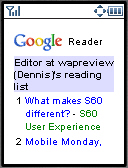
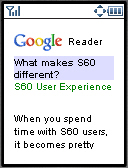
But enough about Google Reader on the desktop, lets look at the mobile version. The opening screen (top image) shows a list of the 9 most recent items from your feeds. The list is compact with just the item title and the name of the feed. Clicking the title or the numbered access key takes you to the item (2nd image). Unlike Bloglines mobile, Reader puts only one item body on a mobile page. Bloglines sends the full text of all unread items from a given feed to you as a single page. That can be 100's of KB's for a high volume, image-heavy feed - more than most mobile browsers can handle.
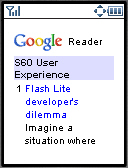
You can also read all the items in a particular feed by clicking on the feed name in the list of  items. Of course, you might have to go through several screens of items before you find one from any particular feed - but that's the way River of News works. When you go into a feed this way, you again see a compact list (third image) of the first nine titles along with the first sixty characters of each entry.
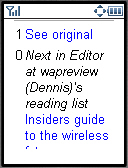
Mobile usability is pretty good in Reader. Access keys are used extensively. The lists of items all have access keys so you can just hit a single numeric key to go to an item. At the bottom of each item are links to the next un-read item, to the full item and back to the list of all items (bottom image). These links have access keys too.
Images in feed items are displayed full size rather than compressed, which could be a problem with feeds that include big images. All links in feeds are retrieved using the Google transcoder - which does resize images. There is a link to the full item on the originating blog, which also uses the transcoder. Although transcoding is a touchy subject with many bloggers, transcoding the full item does provide a mobile-friendly way to read partial feeds.
I was not able to launch Reader Mobile in my favorite Palm OS browser, Xiino as the pages are sent with the mime-type of application/xhtml+xml which Xiino doesn't support. This is likely to be an issue with other PDA browsers, particularly old ones. Google really needs to do browser detection and only send xhtml to devices that can accept it. Most other browsers including Opera Mini work fine. You can launch Google Reader by going to http://www.google.com/reader/m/ or by just going to google.com on a mobile device and choosing personal home page and then Reader.
In summary, I think that Google Reader Mobile is the best mobile-web based rss reader yet when only the mobile piece is considered. Compared with Bloglines mobile it has a much better UI that won't overload your browser. It doesn't have as big an advantage over Feedlot UI-wise but it does support Atom feeds which Feedalot does not. If you are using Bloglines or Feedalot on the desktop, I don't recommend switching unless you can also live with Google Reader on the desktop.
1-July-2013: Shit down by Google