
I want to be able to be able to read RSS feeds on my phone. Feeds are perfect mobile content – mostly text, all meat, none of the stuff like sidebars, headers, frames, navigation bars and popups that make most websites unusable on a phone.
There are a number of excellent web based RSS aggregators but I’ve been having a hard time finding a WAP based one that I want to use regularly. The usability just isn’t there for one reason or another. I’ve found three readers that I have bookmarked on my phones and do use – but they all have nagging flaws that keep me searching for that perfect reader.
My vision of a perfect mobile RSS aggregator is something that works like Bloglines on the desktop.
- When I enter the reader I should see a list of the names of my subscribed feeds and an indication if the feed has any unread items.
- When I click on a feed, all I want to see is a list of just the titles of the entries in that feed. No descriptions – they take up to much screen real estate on a phone.
- When I click on an article title, I should get the full content of that entry broken into pages that are small enough for my phone to handle. Large images should be filtered out or resized to fit my screen and/or I should be able to turn images off.
- There should be a couple of links at the top and bottom of each screen that take me back to the entry list and feed list.
OK, but you say, Bloglines has a mobile version and then there’s Skweezer, Phonifier, MobileLeap, Winksite, RSS2WAP, RSShome, Bloggo and Feedalot. Surely one these eight must do what you want!
Believe me, I’ve tried them all and all but three of them utterly fail meet my basic criteria. Even the three that I do use have annoying flaws that limit the amount that I want to use them.
By the way, if you wrote, funded or otherwise have a personal interest in one of these sites, I’m not trying to be mean. I really, really do appreciate the efforts of everyone working on mobile browsing applications. It’s a difficult and so far mostly unrewarding medium for content providers. It WILL get better, I really believe that mobile is the future. But my role on this site is that of a opinionated critic pointing out what I think is good in mobile browsing – but also what needs improvement.
So what’s wrong with mobile web based RSS aggregators There are two big sins and most of these sites are guilty of one or both.
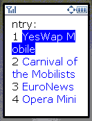
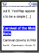
- Trying to show too much information especially on the index page. By index page, I mean the list of items for an individual feed. To me, a mainstream phone has a 128×160 pixel screen. Sure, smartphones have at least 176×208 and feature phones like the RAZR are starting to use that size as well. But most Nokias have 128×128 screens and the entry level Nokias are only 96×65. If you want your site to have mass appeal you have to aim at the mass market devices. There’s an example in the first image, this is Phonifier displaying the index page for this blog’s feed. Compare that with the second image from Winksite, showing an index that works on small screens. Instead showing of a simple list of the titles of the feed’s entries one per line, Phonifier includes the entry’s description (a field in the feed that defaults to the first 270 characters of the item’s text). Except that 270 characters fills three full screens on my phone. So if I want to see the title of the second entry I have to scroll down 3 screens. MobileLeap and Yahoo do the same thing. Skweezer and Bloglines are even worse, they dispense with an index page altogether and dump you into the full text of all the current entries one after another as one giant page (Skweezer does at least break the giant page up so it will load on limited memory phones). To get to the third entry I would have to scroll through the full text of the first entry. That’s 15 screenfulls on a 128×160 phone. Thats OK if you just sequentially read though every post in every feed you subscribe to, but I read far too many feeds for that. I want to be able too scan the entry titles and read the ones that sound interesting and then maybe go back to the titles and read a couple more entries that sound interesting. These aggregators probably work pretty well on something like a PDA, Danger Hiptop/Sidekick or Nokia 9300 with a large screen and dedicated page-down keys. If that’s the target device for some of these sites, fine. But those aren’t the mainstream phones that I’m most interested in.As an aside, why don’t most mobile browsers even have a page down key? I have four browsers on my S60 phone (Nokia’s built in “Services” browser, Netfront, Opera and Doris) and all of then require me to push the D-pad down-key anywhere from 3 to 8 times to do a page down. OpenWave got it right back in their 4.0 browser of several years ago, holding down the down key for abut a second does a page down.
- Showing too little of the item’s content. Almost all the feeds I read are full feeds – that is the entire blog item is in the feed. Many of these readers don’t show you the full item content – ever. Yahoo, RSShome and RSS2WAP are like that. They show only the description or maybe a little more and then don’t even provide a way to go to the host blog to read the item. What good is a reader that gives me a taste of the item and doesn’t let me read it? MobileLeap and Phonifier are a little better, they link to a transcoded version of the item on the host web site. Thanks to the transcoding this is generally readable on the phone. But why a transcoded web page when the full plain text of the item is available in the feed – not only is this a waste of server resources but even after transcoding there’s a lot of web page “furniture” like menus that get in the way of reading the item. These two readers are also guilty of sin number one – making the feed index almost unusable by including the description.
So what are the three readers that I find at least usable? They are Winksite, Bloggo and Feedalot. Each one comes close to being the perfect mobile RSS reader, but in each case there are one or more little irritations that leave me unsatisfied.
Bloggo
Update: This site has been shut down! Too bad, it was great while it lasted.
Bloggo is strictly an RSS reader. To me it would be the ideal mobile RSS Aggregator except for one thing – it’s just too sloooow. How slow? On a PC with a fast DSL connection – it takes 90 seconds from the time I click the bookmark until the first text appears on my screen. That’s with only three feeds, the more feeds you have the longer it takes. Admittedly, it doesn’t take much longer on a phone – but my phone’s browser times out after 30 seconds so I could never get connected to Bloggo until I discovered a work-around. If, after Bloggo times out, I wait or even go browse another site for two to three minutes and then go back to Bloggo, I get right in. Apparently even after I get the timeout error, Bloggo continues to download and cache my feeds. I don’t wait too long however, after about five minutes Bloggo seems to expire the cache and I have to start all over again. It’s it worth the wait? Probably not, but if you try it you will see an absolutely perfect mobile UI. The feed list shows you how many unread items you have in each feed and even sorts the list so that feeds with no unread items fall at the bottom of the list! The item index for each feed lists only titles – as is appropriate for a service targeted at phones. When you read a item you get the full item. The only faults other than the performance are that images are not resized and long items aren’t broken into pages – both of which can be a problem on phones with page size or image limits. You can get around this by reading Bloggo through a transcoding site like AOL’s which resizes images and paginates content.
Usability: ![]() xhtml
xhtml


Feedalot
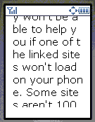
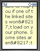
Feedalot is a new service from Jumbuck, a commercial mobile game seller, dating and chat site. Jumbuck doesn’t try to sell it’s services to Feedalot users. Feedalot has great potential, the site is fast, shows the number of unread items in the feed index, titles only in the item index and it displays the full item content (except for images). So what’s not to like about Feedalot. The big issue for me is clearly a bug which I hope gets fixed soon. Feedalot does not correctly handle HTML entities in the RSS item content. Entities are a way of encoding special characters so that they display correctly in browsers. The sorts of characters that are typically represented by entities include the Euro symbol €, Pound £, left and right quotes ‘ ’ “ ” and the ampersand &. Mobile browsers are especially likely to have trouble displaying these characters if they are not represented by entities. Feedalot seems to be trying to convert all problem characters in the feed to entities which would be a good thing were it not for the bug. The problem is that entities all start with an ampersand. When Feedalot sees the ampersand that begins an entity, it converts it into the entity &. Unfortunately, that means that it is no longer an entity – so that “Fred’s Fine Foods” displays as “Fred’s Fine Foods”. The third and fourth images comparing Feedalot with Winksite show how ugly entities can look in Feedalot.
There are a few other issues with Feedalot. One is that doesn’t break up large items into pages. An other issue is that than when Feedalot removes an image it replaces it with “[Image Removed]” rather than displaying the image’s alternate text. All links are also removed and replaced with “[link removed]”. I don’t mind that links are removed but it doesn’t seem to add any value to tell me so each time. Finally, Feedalot displays each item’s description above its content. As the description is usually the first 270 characters of the item, you end up with duplicated content.
If Feedalot can fix the entity issue and also break long items up into pages it will become my preferred mobile RSS reader.
Usability: ![]()
![]() xhtml
xhtml
Winksite
I really like Winksite, I’m working on a full review of the site, and they do so many things so well that I feel bad about critizing their RSS reader. If you don’t know Winksite, it’s a true pioneer mobile institution. It’s made it extremely easy to make a mobile edition of your blog. You can create a new blog on Winksite (editable via WEB or WAP!) or enter your feed url and let Winksite create a mobile blog site from it. Your “mobilized” blog will be accessible from WAP1, WAP2, i-Mode, PDA and even desktop browsers. Did I mention it’s free too! The list of bloggers hosting their mobile blogs on Winksite reads like a who’s-who of blogging’s stars, Om Malik, MobHappy, Smart Mobs, Mobile Jones just to name a few. You can also build simple WAP sites combining static text pages, your own or other peoples feeds, a guest book, chat and surveys. All this without having to write any code.
Winksite’s RSS aggregator is also nearly perfect. The UI features a clean index that lists the titles and nothing else. Numeric shortcuts to the items are provided on every device that supports them. Full item content is shown paginated and you can also get to a transcoded version of the original blog – something you’ll need if you read partial feeds like MobileRead or the BBC. There is only one thing that could be improved. Winksite doesn’t give any indication of which feeds have unread items. I read a number of feeds that aren’t updated daily – when using Winksite I have to go into each one to see if it has anything new. This wastes a significant amount of time on a slow mobile connection. I’m suspect it would be a lot of work to retrofit an unread items indicator into Winksite’s code but it sure would be nice. Even as it is, Winksite is the best Mobile RSS aggregator available today.
Usability: ![]()
![]()
![]()
![]() xhtml/wml
xhtml/wml
Why use a feedreader if sites can convert their feed to WML on the fly, thus giving a better experience to the mobile user?
It’s not that hard, just finished mine and it seems it meets all your requirements.
Take a look at http://acnmobile.atgp.nl
wap rss feed reader but not so good visit http://iwap.110mb.com
hi
Im looking for someone if he/she can help me to build a wap connection in Lebanon for mobiles if only someone could feedback me on my e mail antonio_bassil at hotmail dot com i would be thankful looking forward to hear from you……
Hi! Why I can’t fill my info in profile? Can somebody help me?
My login is Kisakookoo!
Have you tried Blogstreet , works great on my SLVR
RSS2Mobile is an RSS-to-WML service. It lets you read a RSS feed in your WAP enabled mobile.
Bookmark this URL in your mobile’s browser. You can read a feed by typing the RSS URL in a text box provided over there.
http://blogstreet.com/r2m.wml
Alternatively you can append the RSS URL after the following address in your phone’s browser:
http://blogstreet.com/wap/t/
E.g. http://blogstreet.com/wap/t/scripting.com/rss.xml
Snehal
I look at your requirements for the perfect mobile RSS reader and I chuckle…I have been selling our solution in the carrier space and am quite close to having our solution available via large carriers in North America. We will be delivering the exact experience you outline plus some extras like the ability to search for feeds on a site (e.g. cnn.com) and add them to your list on the phone, and key word search so that you can find feeds on a specific topic.
Perhaps if you’d like to try it out, you could contact me and I could set you up on our demo site to try it.
Thanks,
Clark
Pingback: Pablo Noel » Lectores RSS via WAP
Pingback: eCuaderno 3.0: Pistas, noticias y enlaces sobre Cibercultura, Medios, eComunicacion y Blogging por Jose Luis Orihuela y sus invitados
Hi
Thanks for the feedback about Feedalot. We are currently in Beta at the moment so we will have an opportunity to look at the issues you mention in your review.
The display bug you found has been fixed, thanks for the heads up!
Keep enjoying Feedalot.
Cheers,
Mick
Pingback: RSS Haciendo facil lo simple : Noticias RSS | Directorio RSS | Marketing RSS | Consultor RSS | RSS en Español » Blog Archive » T0p 10 lectores RSS gratuitos para Windows
“My vision of a perfect mobile RSS aggregator is something that works like Bloglines on the desktop.
1. When I enter the reader I should see a list of the names of my subscribed feeds and an indication if the feed has any unread items.
2. When I click on a feed, all I want to see is a list of just the titles of the entries in that feed. No descriptions – they take up to much screen real estate on a phone.
3. When I click on an article title, I should get the full content of that entry broken into pages that are small enough for my phone to handle. Large images should be filtered out or resized to fit my screen and/or I should be able to turn images off.
4. There should be a couple of links at the top and bottom of each screen that take me back to the entry list and feed list. “
What do I get if I write one? I already do most of the above when repurposing news from my games news site to other formats by modifying the RSS that’s output automatically. I’m currently delivering the same content (3 years worth, almost 3,000 entries, including images) via Web, WAP, RSS, i-mode, PSP and mobile web. The only difficult part really has been determing how to break up the pages. PSP/I-mode/Web are easy as sizes are either known or can be derived (i-mode helpfully delivers the handset’s cache size as part of the header)
“…I feel bad about critizing their RSS reader.” Hey. It’s all good. Our community drives the service. It’s not criticism to us – it’s insight. Thanks.
Nice revue! Your vision of the perfect mobile RSS aggregator make sense :-) I will try to take it into account while working on iFeedYou (http://www.ifeedyou.com)
Wap-Review on iFeedYou is at: http://www.ifeedyou.com/wap-review/ (from your mobile AND from the web)
BTW… My iFeedYou which is a personnal RSS aggregator is not yet open to public (and might never be since I want to keep a good quality in the service for the current user) but if you want to test it just drop me an email and I will open an account for you! I would be interested to have your feedback.
Greetings