HopStop
www.hopstop.com/pda/ (HTML5)
 To me at least, public transit and the mobile web could make a very enabling combination. When I'm out on the streets and want to get somewhere, I'd love to be able pull out my phone and bring up a little map showing the route from my current location to a nearby bus or subway stop along with step by step directions on how to get to where I want to go on the transit system - including any transfers and a final walking map to my destination. These sorts of services are very popular in Japan and there are a few similar efforts elsewhere. Transport for London has long had a very good trip planner although without the maps and walking directions. i-Metro is a mobile web rail (bus in a few cities) trip planner that covers an amazing 300 cities worldwide, although the interface and is rather bare-bones and again there are no maps or walking directions. A number of transit agencies also have on-line trip planners, some even with walking maps of the start and destination areas. However, all the ones I've seen are rather mobile unfriendly with frames, popups, javascript, large images and maps in pdf or other formats that are rarely supported on mobiles. A trip planner that requires a PC to use is just wrong. I'd much rather pull up transit information on my phone rather than have to plan everything out on the computer first, then print out directions and maps which would become useless as soon a I changed my plans.
 Steve Rubel at Micro Persuasion linked to an ambitious new mobile transit planner called HopStop which currently covers New York, Boston, Washington and San Francisco with planned coverage of Philadelphia, and Chicago as well as expansion of the New York and Washington coverage coverage into Long Island, New Jersey and Maryland.
HopStop.com has a full-sized web based service but clearly recognizes that transit users are far more likely to have a cell phone available when they are out on the streets trying to get somewhere. There are actually three different mobile HopStop services. There are two SMS services - both of which require that you register on the HopStop website before using them. Once registered you send an email containing your starting point and destination to HopStop which returns an SMS containing your directions. I suppose cost is the reason an email rather than a short code is used, which is unfortunate, most US users don't even now that they can send email from their phones (and they can't from some some of them). A variant, available only in New York uses an interactive voice recognition system - you tell the system your start and end addresses and the directions are sent to your phone also via SMS. The third HopStop mobile service is web based and requires no registration, just point your mobile browser at www.hopstop.com/pda/ and you ready to plan a trip.
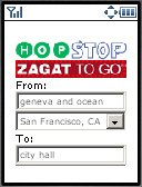
In general, I found web based HopStop Mobile well thought out and quite usable. The interface is simple and intuitive, after selecting a metropolitan area you just fill in free-form From: and To: text boxes and hit the Search button. The address parser is quite smart. It doesn't require "st.", "ave", etc. suffixes and handles address, cross streets , landmarks and business names interchangeably. There are also some options you can choose; there's a dropdown which lets specify that the address is in a specific suburb, you can chose to be routed by rail only, rail plus bus or walking. You can specify the day and time you want to travel, which should default to current time, although in the San Francisco beta, the default is three hours ahead of the current time. Finally you can choose between "More Transfers" and "More Walking". Another great feature is that HopStop supports 10 languages (Chinese, English, French, German, Greek, Italian, Russian, Spanish and Swahili). Only the results are localized not the data entry interface which is always in English.
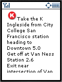
The results consist of turn by turn directions from your current location to the initial station or stop, and then for each transit leg, the name of the bus or rail line and stop to get off or transfer at as well as the approximate travel time. Finally there are turn by turn walking directions from transit to you destination. The text directions are followed by small (120 x 240 px) street maps of each walking leg with the route highlighted.
HopStop puts a 120 x 20 px banner ad at the top of most screens. I think this ad format is perfect for a mobile device, it provides prominent visibility for the ad but don't interfere with using the service. The only problem is that clicking the mobile ad (there only seems to be one, for Zagat) loads a full web page that's not very usable on a phone browser
There were some still some minor beta gotchas with using HopStop. Keep in mind that I did my testing in San Francisco which was just added to HopStop and is clearly labeled as a beta. The other cities are out of beta, but I don't know my way around any of them well enough to do meaningful testing. Anyway here's a few things that still need work.
 As I mentioned, the time defaults to the current time in the Eastern Time Zone, three hours later than San Francisco time. You can and should change the time particularly if you traveling in the evening, otherwise you my get routes using the limited after midnight "owl" service long before the regular lines stop running and the owl wakes up. It also doesn't help that the Time: field is at the very bottom of the screen and is a dropdown listing times in half hour increments starting at midnight. That's 48 rows in the dropdown - a lot of scrolling to get to 11PM, for example. Many phones do a lousy job of implementing drop downs (no incremental search or page-down so it takes 46 presses on the down key to get to 11:30 PM). A much better design would be Hour and Minute text fields - entering numbers on a phone keypad is a breeze, particularly if the page forces numeric input with the
 format="NNNN" or style="-wap-input-format: 'NNNN'" attributes of the text input tag.
HopStop doesn't seem to be aware of the BART rapid transit system, always routing via on the slower, more expensive and more crowded Muni bus and light-rail lines.
There were a few times when I got directions telling me to transfer to a different line in the subway to continue my trip when staying on the original line would have gotten me to my destination just fine with no transfer needed. There was also one particular pair of cross streets that I entered and got a dialog telling me that my exact address wasn't recognized and offering me a list of four similar addresses to choose from. Nothing wrong with that, except that all four alternate addresses were the same and also the same as what I had entered originally!
It also would be nice if HopStop covered more of the San Francisco metropolitan area, currently only San Fransisco, Daly City and South San Francisco are covered. That leaves out significant urban centers like Oakland, Berkeley and the whole Silicon Valley. If the expansion in to Maryland, Long Island and New Jersey is any indication I suspect that HopStop will be eventually expand to cover more of the Bay Area.
Even with the beta warts, HopStop is a already a very useful tool for transit users in any of the covered cities. It displayed beautifully on both my phone's built in Openwave V7 browser and in Opera Mini. Although HopStop's routes were sometimes less than optimal, they were always accurate - following them will get you were you are going.