Engadget
m.engadget.com/ (HTML5)
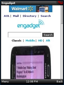
One of my favorite tech news sites, AOL's engadget.com, recently started forcing Opera Mini users to a new mobile version of the site that looks like it was designed for legacy dumb phone browsers (image). I could live with the boring plain text on a white background, but not with the severely degraded and distorted images. But the worst part of the new design is the pagination, which breaks most articles into multiple tiny pages. Even on dumbphones, Opera Mini can load extremely large pages, so the pagination is completely unnecessary.
The way Engadget looks and works in Opera Mini annoys me so much that I created an Opera Mini bookmarklet to sort of fix it. Click here and follow the instructions on that page to install the bookmarket. When you land on one of the paginated Engadget mobile pages, go to you bookmarks and click the bookmarklet and the desktop version of the same page will load.

