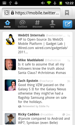
Yesterday Twitter announced that it was in the process of rolling out a new design that would unify Twitter’s look and feel across all platforms. The new full Web version will be rolled out slowly but according the Twitter the new look is available now in the Android and iOS apps and at mobile.twitter.com. At least that’s what they say.
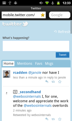
I headed over to mobile.twitter.com to look at the new design. And to my surprise I saw the “old” Twitter mobile site (image above, left). I was using Opera Mini, so thinking maybe it was not supported, I switched to Opera Mobile 11.5 – no change. The Symbian Anna browser was “unable to connect” to mobile.twitter.com at all! I finally had better luck with Android. The Froyo and Gingerbread browsers are getting the new layout. So apparently only iOS and Android. At least I’m still seeing the old version in the bada and WebOS browsers. I don’t have a WP7 or BlackBerry OS 6 device to test with.
I’m not really complaining about the lack of cross platform support in the new Webapp. The old one is still available for the unsupported platforms (except Symbian^3 where Twitter is currently broken) and it works pretty well, even with feature phone browsers.
The new webapp does look gorgeous, I’ve got to give credit to Twitter’s designers for that. Will I be using it? Probably not that much. I’m a big fan of the “old” editabe re-tweet, which Twitter for some reason refuses to support. Plus, when it comes to Twitter mobile Web apps, nothing I’ve seen comes up to the high standard set by Dabr. Update: 16-Jab-2012 It looks like this new Twitter webapp supports something called a “quote tweet”, which is essentially an editable re-tweet except that instead of using the “RT” convention, it wraps the original tweet in quotation marks.
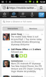
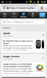
There are some some pretty big paradigim shifts in the new design. The old “Mentions“, “Favs” and “Messages” tabs are gone, replaced by “Connect“, “Discover” and “Me“.
- “Connect” combines other users interactions with you; new followers and old and new style re-tweets.
- “Discover” has the search box plus the top trending hashtag and most retweeted link.
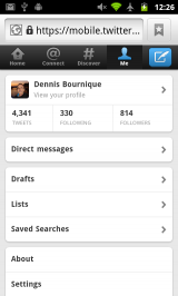
- “Me” is your profile, including your tweets, DMs, Drafts, Lists and Saved searches.
I think the new organization generally makes sense, although it will some getting used to. However there are two areas where I think the new Twitter is harder to use than the old, DMs and hashtags.
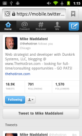
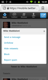
- DMs are now buried on the “Me” tab rather than having a tab of their own. The DM button on friend’s profiles is gone too. Instead there’s a “Send A Message” option hidden behind the “following” dropdown on profiles. Not very intuitive. Before you could tap a friend’s handle in your timeline to quickly DM them. Now it takes several additional taps.
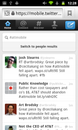
- Using hashtags as event back channels is also less convenient. In the old Twitter you could tap a hashtag in any Tweet to bring up a time line of all Tweets with that tag. The tweet box was prefilled with the tag so you could easily join the conversion. Now you have to go to “Discover” and search for the tag to see the Tweets. And you have to re-type the hashtag everytime you want to use it in a Tweet of your own.
In summary, the new mobile Twitter Web app looks good. It seemed quick and smooth on my Nexus S 4G. But with lack of editable re-tweets and serious usability issues around hashtags and DMs I think I’ll stick with Dabr.
That’s why I only do Facebook,it is 30 times better,
Apples and oranges. I spend a lot more time on Twitter though.
Tried twitter on a Blackberry 9300 running os5 and was served up the old mobile version.
I’m really upset by browser sniffing… It’s sad to see how mobile developers are making Websites aiming only for the top used browsers. Actually they’re aiming solely on WebKit, while Opera is also very used and all the other browsers cited are able to run the Website fine. :/
I hate the previous version(s) and searched for alternatives since day 1. I ended up discovering Dabr, Tuitwit and Tweete are the best ones as they offer much more features than Twitter’s official client.
I see how they made DMs and hashtags worse. I’m sure there’s space there to put a DM button!
And you can’t click hashtags, incomprehensible… Aren’t you able to click usernames/links too? In the screens they don’t look hyperlinked.
It seems that you have to click an empty space on the tweet to have the options to reply, RT, favorite, etc, is it?
You can click username in the timeline to go to that user’s profile. When you click anywhere else on a except the name it opens the tweet in a page by itself with retwwet, favorite and reply buttons and on that page you can click a hashtag to view the tag’s timeline. But you still have have to re-type the tag to use it in a tweet.
Very bad, they increased the number of steps to do everything!!