WPMU.org is a great resource for WordPress publishers and developers. Don’t be put off by the site’s name which suggests it’s about the “MU” multi-user/multi-site version of WordPress (which no-longer exists as a standalone product). Actually, WPMU.org is the most popular independent site covering WordPress and BuddyPress. Packed with WordPress lore, news, tips, tutorials and theme and plug-in downloads, it’s a site that should be of interest to anyone who runs a WordPress or BuddyPress site.
Last July WPMU.org was redesigned in the “responsive” style which means that the site adapts itself, using mainly front-end (client side) logic, to a wide range of browsers, both desktop and mobile. In a post about the re-design, one of designers talks about how they used a “mobile first” approach that delivers 320 px wide images by default so that mobile devices don’t have to download large graphics intended for desktop browsers. If the front-end code detects a wider viewport, it replaces the images with larger ones.
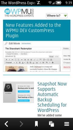
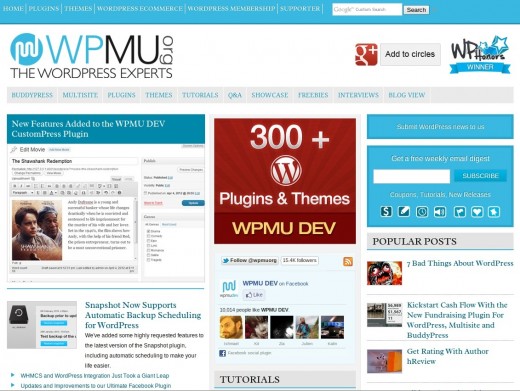
The design targets devices ranging from modern mobile browsers with a screen width of 320 px or more on up to tablet and desktop browsers. I tried it with the Android Gingerbread browser, Opera Mobile 12, Opera Mini 7 and Firefox Mobile 12 (all on Android) and with the WebOS 1.4.5.1 and Symbian Belle (image top, right) mobile browsers and in Chrome (image below), Firefox and Opera on the desktop. The site generally looked good and worked well on all of them, which I find pretty impressive. The only glitch I noticed was that lightbox images in posts where badly clipped on the right side on all my mobile devices (image right). Hopefully this can be fixed.
The mobile first approach works pretty well. According to Opera Mobile 12.0 for Android, the homepage was a relatively svelte 247 KB in the mobile browser, while in Firefox it was 1184 KB.
Filed in: Wap Review Directory – RSS – Blogging
Mobile Link: wpmu.org


Good