With the demise of Google Reader lots of users seem to have given up on RSS. Which is a shame as it’s still the fastest, most efficient way to keep up with lots of news sources. There’s a new breed of free news readers that are as good or better than Goggle Reader ever was. Here are five that work on the desktop and in at least some mobile browsers.
The readers were tested for cross-browser support in desktop Firefox and Chrome and with the Android browser and Opera Mini for Android. Cross browser support varied with the majority of the RSS readers having issues with one or more browsers.


InoReader
Mobile Link: inoreader.com/m
Rating: Features ![]()
![]()
![]()
![]()
![]() Cross-Browser Support
Cross-Browser Support ![]()
![]()
![]()
![]()
![]()
Doctype: html
Home Page Weight: 453 KB (178 KB compressed)
Category: RSS Readers
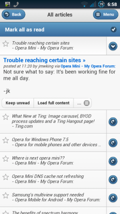
InoReader (images above) is my current favorite mobile and desktop RSS/Atom Reader. It’s lightweight, fast, stable and seems to do the best job of staying up to date with new items.
InoReader uses separate mobile and desktop templates. The user interface in both versions is similar to Google Reader’s final desktop and touch mobile versions. But, unlike the touch version of Google Reader, InoReader works well in Opera Mini.

The Old Reader
Mobile Link: theoldreader.com
Rating: Features ![]()
![]()
![]()
![]()
![]() Usability
Usability ![]()
![]()
![]()
![]()
![]()
Doctype: html
Home Page Weight: 1504 KB (586 KB compressed)
Category: RSS Readers
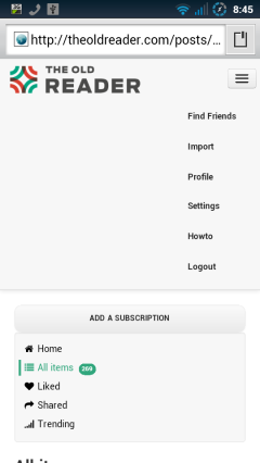
The Old Reader (image below, left) seems to have been inspired by Google Reader before before Google removed all the social features. It lets you follow other user’s feeds and easy share content with other Old Reader users and on Facebook. After Google Reader shut down The Old Reader was my favorite until I found InoReader.
The Old Reader is probably the most popular of the current crop of mobile friendly Web based readers and it got badly overloaded right after Google Reader shut down. It was slow and offline a lot at first but seems stable now.
The Old Reader uses a responsive design which works well in the Android browser but has a lot of wasted space at the top of the screen. It’s usable in Opera Mini but some features like marking items as read are broken.

AOL Reader
Mobile Link: reader.aol.com
Rating: Features ![]()
![]()
![]()
![]()
![]() Usability
Usability ![]()
![]()
![]()
![]()
![]()
Doctype: html
Home Page Weight: 671 KB (253 KB compressed)
Category: RSS Readers
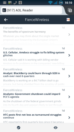
The AOL Reader (image above, right) has a clean design and the ability to star favorite items and share or save them on a long list of services including Twitter, Facebook, Google+, Linkedin, Readability, Evernote, StumbleUpon and Weibo.
AOL Reader uses separate desktop and mobile layouts. It works well on the desktop and with the Android JellyBean Browser and Firefox for Android. But it locks up in the Android Gingerbread browser and the login form is broken in Opera Mini.

Curata Reader
Mobile Link: reader.curata.com
Rating: Features ![]()
![]()
![]()
![]()
![]() Usability
Usability ![]()
![]()
![]()
![]()
![]()
Doctype: html
Home Page Weight: 418 KB (168 KB compressed)
Category: RSS Readers
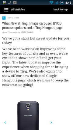
Curata Reader (image below, left) has what I think is the most attractive visual design of the five readers. I like that it displays items in expanded form rather than as headlines or excepts that you have to click to expand. However it only displays the 20 newest items with no way to see more.
Unlike most readers Curata doesn’t keep of what you have read and can’t show you only unread items. That might bother some users but it’s not a big deal to me as I like to read feed items chronologically from the newest to the oldest. When I find myself re-reading something I’ve seen before I know I’m done.
Curata Reader has good social features. You can give flag items for latter reading, give them a thumbs up or down and share them on Twitter, Facebook or by email. Curata Reader worked in all the tested browsers.

Newsvibe
Mobile Link: newsvi.be
Rating: Features ![]()
![]()
![]()
![]()
![]() Usability
Usability ![]()
![]()
![]()
![]()
![]()
Doctype: html
Home Page Weight: 436 KB (263 KB compressed)
Category: RSS Readers
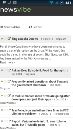
Newsvibe (image above, right) uses a responsive design which unfortunately seems to work better on PCs than phones. The login form is truncated and unusable work in portrait orientation in the Android browser. You have to switch to landscape to log in and then pages don’t reflow properly when switching back to portrait. Another annoyance in the Amdroid browser is that pages are formatted slightly wider than the screen making them tend to skew sideways when scrolling.
But the biggest misfeature of Newsvibe is that it only displays excerpts of items even if the feed contains the item’s full text. That forces you to click through to the source site to read the rest wasting time and bandwidth . Newsvibe also seems slower than other readers to pickup new items.
Newsvibe worked in all tested browsers except Opera Mini where the log in form is missing.