 Mobile browsers designed to display any web page, often called “Full-Web” mobile browsers, are starting to drive a significant amount of traffic to both mobile and non-mobile sites. Smartphones usually have a full-web browser like Opera Mobile, Netfront, Palm Blazer, Mobile Internet Explorer or the Nokia Mini Map Browser. Smartphones sales have broken into double digits and it’s reasonable to expect Smartphone users to use the Web much more than those with more humble devices. Opera Mini makes a big contribution to the full-web browser contingent with 12 million users worldwide. The popular Danger Hiptop/Sidekick is another mass-market device with a full-web browser.
A few years ago, it was conventional wisdom that mobile users don’t browse, they have a few sites that they use for specific tasks like checking the weather, sports scores or flight arrivals but don’t click on links just to see where they lead like so many of us do on our PC’s.
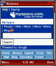
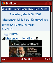
With an unlimited data plan and a good full-web browser it’s become easy and practical to actually browse the web on a phone. I spend my commute reading blogs and full length articles from papers like the New York Times. I don’t hesitate to follow any link that looks interesting because I know my Opera Mini browser will load the page in a (usually) easy to navigate format with all images and most interactive features like polls and comment forms intact and workable. The images in this post demonstrate how well the PC sites of MySpace, MSN and Slashdot render in Opera Mini. More and more, the mobile web is just the Web. This trend is being accelerated by improvements in the infrastructure of the mobile web; networks are getting faster and data plans are moving to flat-rate. The way people use the web on mobile devices is changing.
This is a bit of a turn-around for me as I’ve always argued that a full web site designed for a PC browser will be frustratingly hard to navigate using a handheld device and that mobile users need sites optimized for mobile browsers. I still believe this is true but the latest full-web browsers make PC sites useful and usable on handhelds and fill a real need. The mobile web is very much a subset of the full web and a small one at that. Good mobile sites make it easy for users to get to the information they need most while mobile like the weather forecast for the rest of the day and tomorrow, the latest headlines and scores, the user’s current location and what’s of interest nearby. But there’s more to the web than what’s on mobile sites. I want to be able to drink the full long-tail richness of the web while mobile, or at least while passing the time on public transportation. So while I believe that mobile specific sites provide the best mobile experience, I also expect modern mobile browsers to load any web page and make non-mobile pages as usable as possible on the handset.
 With more and more hits coming to PC sites from mobile full-web browsers, web designers need to start paying attention to how their sites will look in this new class of browsers. Full-Web mobile browsers manipulate non-mobile web content to make it more usable on the small screen by techniques like reflowing multi-column layouts into a single column, ignoring fixed width block elements and resizing images. This works better on some sites than others. Not surprisingly, pages on Opera.com tend to look great in both PC and mobile browsers. But most Blogger and WordPress blogs are very usable in full-web browsers too – although this depends on what blog theme the site is using. There are relatively easy things web developers can do to make the full-web mobile browser’s job easier. Opera has a good explanation of how their Small Screen Rendering works and how to exploit in Authoring for Small-Screen Rendering. I think the most important ideas from that article are:
- Avoid frames and tiled images. No mobile browser handles frames well. Most only display one frame at a time with a menu to switch between them. Tiled images will be reflowed so that the tiles are stacked vertically one above another – not pretty.
- Document order plays a big role in how a site renders in full-web mobile browsers which generally display markup in document order. CSS positioning will be ignored and elements that appear first in the html source will be rendered first. Putting a site’s main content above any sidebars and navigational menus in the document source will produce a much more usable page on a mobile full-web browser. CSS can be used to move the elements to their desired position when the page is rendered in a PC browser.
Full-web browser vendors offer number of resources to help web developers optimize their sites for the small screen.
Opera:
Designing With Opera Mini in Mind
The Phone Factor
Making Small Devices Look Great
Netfront:
Production Tips Smart-Fit Rendering
Nokia:
Nokia Web Browser Design Guide
Microsoft:
Designing Web Sites for the Internet Explorer for Pocket PC
I think that despite the fact that sites can get reformatted, it will never be possible to avoid having a separate mobile site. that is because the needs of the users depends on the way he is accessing information. I am not interested in the same content -or at least in the same form- if I am on the go or at home for example.
Services really successful for the mobile will thus have to be designed for the mobile.
Rgds,
G.
——————————
http://www.thefrenchtouch.nl