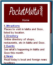
Information on events, attractions and other visitor services for the Mediterranean island nation of Malta. The site also has Malta and international news headlines and directory of shops, restaurants and clubs, a page of information about Malta and another with click to call numbers for emergency services
The directory of shops and services seems incomplete with, for example, only a single listing (a hairdresser) in Birkirkara, Malta’s largest (population 21,000) town. Most listings contain only the business name and address, but on some clicking a More Information link reveals a page with hours and click- to call numbers. All the information about an establishment could and should easily be on a single page. The second click is a waste of time and energy on mobile where minimizing clicks is an important element of usability. Source: Mobility.mobi
Filed in: Wap Review Directory – Travel-Transit/Destination Guides
Ratings: Content ![]()
![]()
![]()
![]()
![]() Usability
Usability ![]()
![]()
![]()
![]()
![]()
Ready.mobi Score: 5 “Good”
Mobile Link: pocketmalta.mobi
PocketMalta,
Thanks for your comment. I understand what you are saying but but remember “content is king”. With such limited content, it will be hard to get traffic and without traffic hard to get businesses to pay for listings. Higher traffic could also make pay per click ads (AdMob, AdSense) feasible as an added source of revenue
You might consider filling up your directory with a usable number of basic listings to drive traffic and then selling business owners on enhanced listings.
The reason you find one business in each page on the directory is, because the directory has just been launched recently.
The thought behind the second click is:
The first click takes you to a page with a list of businesses.
The second click takes you to a detailed info about the business the visitor chooses.
We are offering 2 types of listing, depending on what the business owner affords. That’s why you find some with “More Information” and some without.