Firefox Mobile – Truncated header background
Update: A couple of days after I originally wrote this piece, Firefox Mobile RC3 went golden as Firefox Mobile 1.0. As far as I can tell their were no code changes between RC3 and 1.0 so the content of this piece is relevant to the initial this the first non-Beta release of Firefox Mobile. There have however been updates to some of the extensions most notably “Weave”. I’ve also found the elusive “Tabs From Other Computers” are hiding and updated the piece to reflect that
Talk about good timing! Just as I was about try Firefox Mobile (aka Fennec) on the N900 I have on loan from WOMWorld, Mozilla released a new version. It’s RC3 – which a few days later RC3 was re-released as Firefox Mobile 1.0. It’s said to include significant performance and stability improvements, however Flash is disabled by default in this release because, according to Mozilla, it “degraded the performance of the browser to the point where it didn’t meet our standards“. If you are using a N900 or N810 and have an earlier version of Firefox Mobile there is an update to 1.0 waiting for you in the Maemo Application Manager, otherwise can download it here.
Although both MicroB and Firefox Mobile are based on the Gecko engine there are major differences between them in terms of performance, user interface and extension support.
Performance
I hadn’t used any of the earlier releases of Firefox Mobile as I didn’t have a compatible device until now. But I’d heard complaints about sluggish performance with earlier versions of the browser. So I was pleasantly surprised when I tried 1.0 and pages seemed to load as quickly as with MicroB. Startup time and scrolling speed were a bit slower than with Nokia’s browser and there were occasional “hangs” where the browser seemed to be ignoring clicks or scrolls.
FireFox Mobile’s page rendering is good, sometimes better than MicroB’s and sometimes worse. Many sites, like IntoMobile use tabbed top navigation menus. In Micro B the tabs tend to wrap and overlap (image below). Firefox Mobile (image above) gets that right but prematurely truncates the blue background behind the banner image and search box.

MicroB – Menu wrapped and overlapped.
User Interface
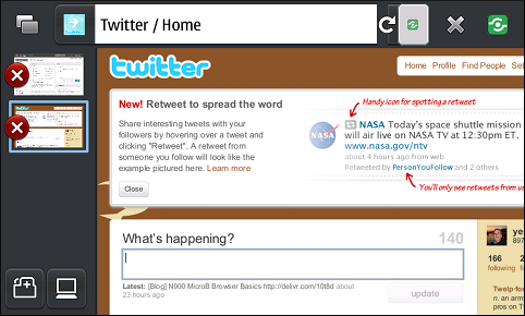
Firefox Mobile has a UI like no other browser. Instead of dropdown menus and toobars, you slide a finger toward the sides of the screen to bring up various UI elements. Slide left to see open tabs, slide right for back and forward buttons, bookmarks and browser options. Sliding in either direction also brings up the URL bar, which Mozilla calls the “Awesome Bar” because it does auto completion based on your browsing history and bookmarks. The Awesome bar has the reload and stop icons and an icon for the Maemo task switcher.

I wanted to hate Firefox’s user interface but after using it a bit I’m mostly OK with it, at least the touch portion. Common tasks like bookmarking a site, switching tabs or bringing up a menu require fewer or the same number of taps as with MicroB. Although Firefox Mobile’s UI is unusual, it seems more intuitive than MicroB’s quirky combination of gestures, hidden toolbars and the main menu hidden behind the page title.
Holding Ctrl and tapping a link opens it in a new tab in the background (without switching tabs). This is a big improvement over the convoluted dance that MicroB requires to do the same thing: first a long press on link for the context menu, then choose “Open in new window”, watch while MicroB switches to the new window where you either have to wait for the page to load or bring up the task manager to switch back to the original one!
Things I don’t like about the Firefox Mobile UI are that it hides the very useful Maemo notification area and disables some of the Maemo system shortcut keys like Ctrl-Shift-P to take a screenshot. Also missing are some standard browser shortcuts like Ctrl-D to bookmark the current page and Ctrl-R to refresh the page. Firefox Mobile does implement some other keyboard shortcuts (complete list) like Ctrl-T to open a new tab and Space – page Down and Shift-Space – Page Up but I really miss Ctrl-D and Ctrl-R, which I use extensively.
Firefox Mobile’s zoom features are more limited and less effective than MicroB’s. Both browsers support double-tap to zoom in/zoom out and both fit the current column to the page width when you do so. But FireFox Mobile doesn’t zoom using the volume rocker and doesn’t have any equivalent of MicroB’s swirl to zoom gesture. It does let you zoom in and out over a wide range of rather coarse steps using Ctrl-Up Arrow and Ctrl-Down Arrow. Unlike MicroB’s hard to type but useful Ctrl-Shift-I, Firefox has no way to reflow text after zooming in. Text size is not adjustable independently from zoom and there is no portrait mode support either. These limitations combine to render sites that use a single full width column, like many mobile web sites, almost unusable. When zoomed out so the column fits the screen, fonts are too small for easy reading. When you zoom in to make text readable, lines become wider than than the screen and horizontal scrolling is required, which is unacceptable in my book.

Extensions
Firefox Mobile wins here with has 25 supported extensions at the moment. I could only find two MicroB extensions. There doesn’t seem to be a single comprehensive catalog of MicroB extenstions. Only Location Provider and Single sign on for Ovi are listed under Add-ons in the browser menu. I thought there were four more available in Maemo Browser Extras they turned out to be incompatible. There may be other extensions somewhere, but where?
The most interesting Firefox Mobile add-on is Weave, which is supposed to synchronize your bookmarks, tabs, browsing history and remembered passwords between Firefox desktop and mobile browsers. It works pretty well, at least for bookmarks. It took about a minute for Weave to bring in the 50 or so bookmarks that I have on my desktop. They appear in the Awesome Bar, to see your imported bookmarks, click the Awesome Bar, then click “See All Bookmarks” and then “Desktop Bookmarks”.
I’m not so sure where to find your desktop tabs in Mobile Firefox. I saw them listed under a “Tabs from other computers” item in the Awesome Bar once, but I can’t seem to figure out how to get back to them. Update: Tabs from other computers can be found in the left hand menu area. Password syncing seems hit or miss. It works with some sites but I have to enter my credentials in Mobile Firefox for other sites that have remembered passwords on the desktop.
Conclusions
Firefox Mobile is a promising Beta. I like the GUI, which I expected to hate, but that alone not enough to outweigh the lack of Flash and slower startup and scrolling. The biggest show stopper is not being able to get a readable font size without horizontal scrolling on some sites. Firefox Mobile development is proceeding rapidly and I expect to see performance and usability improvements over the next view months that may eventually make Firefox a top mobile contender.
Maybe there’s min-height used on CSS at some websites. Even desktop Firefox does not display it correctly.
Anyway, it’s nice to hear there are alternatives for Maemo 5 as well :)
Thanks for catching that Ctrl-Shift-P typo, timeless.
You are right about the background truncation with IntoMobile on Firefox Mobile, beging a site design bug. It’s reproducible when I re-size the viewport to 800×480 in Firefox.
Not so sure about the wrapped, overlapping menu though. It doesn’t happen in Firefox at 800×480 or with Opera Mobile 10 or the Nokia browser on a Nokia N95.
fwiw, the rendering errors you’re encountering at intomobile are the site’s fault, not MicroB and not Fennec. The authors wrote bad css and didn’t test it properly.
You should be able to reproduce both problems by taking a desktop browser and reducing the browser window width.
> Things I don’t like about the Firefox Mobile UI are that it hides the very useful Maemo notification area and disables some of the Maemo system shortcut keys like Ctrl-P to take a screenshot
The keystroke is Ctrl-Shift-P, not Ctrl-P. I’m not saying they didn’t break it (I know a couple of other apps which do, for which I intend to file bugs), but please don’t give out incorrect advice.