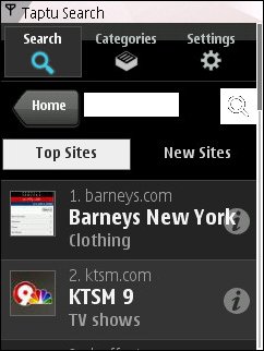
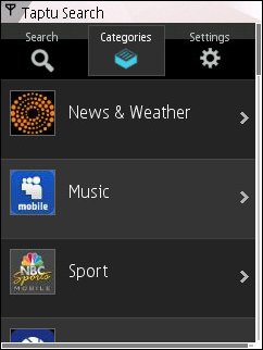
Mobile search company Taptu has taken the wraps off their latest project. Billed as “The World’s largest Directory of Web Apps & Touch Friendly Sites For Owners of Mass Market Touch Screen Mobiles“, it’s modeled after the iPhone App Store with mobile web apps and sites organized into categories like News & Weather, Music, Sport, Entertainment, Social and Technology. The directory is searchable and features rotating galleries of “Top Sites” and “New Sites”.


You can reach the Taptu directoy by visiting Taptu.com and clicking the “Categories” tab at the top of the page. If you are using an older phone and don’t see the tab, click the “Full Site” link near the middle of the page to bring up the Touch version of Taptu. I was able to open the new version with every mobile browser I tried except Opera Mini where the “Full Site” link just seems to reload the “Lite” version of the site. Taptu uses image resizing and pagination to keep page sizes below 50 KB making it compatible with many basic feature phones
In their press release announcing the directory Taptu frequently uses the word “Touch“. I have a bit of a problem with that. Mobile browsing is evolving away from simple WAP sites to full-blown webapps, but the new class of rich mobile web sites has more to do with HTML5 and JavaScript support, larger screens and faster networks than with touchscreens.
I understand that Touch is a hot mobile buzzword these days, but I don’t think using it as a differentiating term is the best approach to driving traffic to the new site. Taptu’s directory looks and works great with non-touch BlackBerrys, Windows Mobile and Symbian handsets and even the more capable non-touch feature phone browsers. The same is true of almost all the sites listed in the directory. But currently only 14% to 20% of all new mobile phone sales are of touchscreen devices. Tagging the directory with the Touch label discourages 80 to 86% of Taptu’s prospective user base from even trying it out.


Touch screens do have some advantages for mobile browsing. Touch-only designs make larger screens possible in a pocketable device. Good touch aware site design can definitely make page navigation faster and easier and improve the overall user experience.
But non-touch screen devices have their own advantages. It’s easier to integrate a good physical keyboard into a compact device. Non touchscreen browsers don’t suffer from the confusion between scrolling and clicking that sometimes occurs with even the best touchscreen browsers. The cost of manufacture of a non-touch handset with good browsing capabilities is less than that of touch device.
The cost differential between touch and non touch will decrease over time and touch browsing usability is bound to increase too as will touch market share. But the biggest opportunities for mobile web growth today are the developing world and the teen and pre-teen markets. These are price sensitive markets and also ones where good text messaging capabilities are a requirement, both factors that favor non-touch devices.
I like Taptu’s Touch Web directory. It’s gorgeous, easy to navigate and goes a long way toward improving the discoverability of mobile web sites and apps. I think mobile web “stores” like this will play a big role in facilitating the switch from native mobile apps to mobile web apps that’s on the horizon.
But we really need a better label than “Touch” for the next generation of the mobile web. I’m not crazy about “Rich Mobile Web” either but it is getting some traction and I like it better than “Middle Web” which is meaningless to most people and conjures up connections with “Middle Earth” and “Middle School” in my mind. “Mobile Web 2.0” is undefined and tired. I guess I’ll go with “Rich Mobile Web” until a better buzzword comes along.
thanks for the info. is there a way to open full site USING mini 5 ?
i too tried. but couldn’t
Not currently. Taptu is working on making the new directory available in Opera Mini
Yeah i totally agree. Power users who are more likely to browse a site like taptu are most likely to own a phone with a physical keyboard as typing and scrolling is way easier and much more accurate. Users with touch screen devices are more likely to be of the wealthier that don’t have the time or knowledge to browse sites outside the google, facebook, twitter and yahoo spectrum. Think taptu is looking at the apple appstore and getting carried away.