I’ve been thoroughly enjoying the HTC Evo Android phone that I got at Google I/O a couple of week’s ago. Google and Sprint gave Evos to all 5000 I/O attendees, press included. Sweet and thank you very much.

I’m going to devote most of this post to the browser but first a few words about the phone itself, particularly two areas that have gotten some criticism in the press; the phone’s size and battery life.
The Evo is a large phone, but I think it’s actually the ideal size for a pocket-able web-centric device. It’s slightly larger in every dimension than the iPhone, but at 13 mm it’s still extremely thin. The width and height are nowhere near too big to fit in any of my pant’s front pockets and the phone’s thinness actually makes it less noticeable in the pocket than smaller but thicker handsets like the Nokia N95 that’s been in my pockets constantly for two and a half years.
Battery life is not great, but it’s not terrible either. I average about twelve hours between charges, which is perfectly acceptable with me. My use includes calendar, contact and Gmail syncing in the background. I also have TweetCaster checking for new replies and DMs every three minutes. I make a few calls, texts and occasionally take a photo. But mainly I use the browser, typically spending 3 to 4 hours on it. There’s no WiMax in San Francisco yet, so 4G is off and I also turn off WiFi and GPS except while actually using them. Twelve hours between charges is also about what I get with the same usage on a Google Ion (HTC Sapphire), so as far as I’m concerned the Evo’s battery usage is typical Android.
Where the Evo really excels is as a pocketable web tablet. The 4.3 inch 800×480 screen and a browser with strong CSS and JavaScript support combine to deliver a near desktop experience. In landscape orientation some non-mobile sites are readable when fully zoomed out so the full page width is visible. Web pages generally look and work great too.
The Evo is running Android 2.1 with HTC’s Sense enhancements. The HTC changes include several that affect the browser. The biggest is the inclusion of Flash Lite version 4 which handles content that requires Flash Player 10 or ActionScript 2 and 3. What this means in practice is that many of the Flash videos, animations and games found on desktop sites work. I had no trouble watching YouTube videos, playing PhoneDog.com’s One Paw Bandit game or the Ball Lines game on Yahoo. Not everything works of course, I couldn’t get Vimeo or Hulu videos to play and many Flash games, while they technically work, were unplayable because they weren’t designed with touch screen input in mind.
Unfortunately the Flash support also means that most animated ads work too. There doesn’t seem to be any way to disable Flash on the Evo but didn’t notice much of an impact on the browser’s excellent responsiveness, even on sites with multiple animated ads.
A truly great feature of the Evo browser is the “Mobile view” toggle in the browser’s settings menu. What this does is toggle the browser’s user agent between a typical Android one:
Mozilla/5.0 (Linux; U; Android 2.1-update1; en-us; Sprint APA9292KT Build/ERE27) AppleWebKit/530.17 (KHTML, like Gecko) Version/4.0 Mobile Safari/530.17
and one that makes it look like you are using Safari on a Mac!
Mozilla/5.0 (Macintosh; U; Intel Mac OS X 10_5_7; en-us) AppleWebKit/530.17 (KHTML, like Gecko) Version/4.0 Safari/530.17
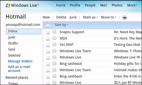
With mobile view turned on sites consistently served their touch or mobile versions. With it off, I always got the desktop one, even on sites like Hotmail where it’s almost impossible to get anything but the mobile version with other phones. BTW, Microsoft, the desktop version of Hotmail (image above) works perfectly in the Android 2.1 browser, so how about giving Android users the option to use it without User-Agent spoofing?
I generally leave the browser set to mobile view. I prefer to use mobile sites whenever possible, after all that’s what I write about here on WapReview. But it’s great to have the option to force the desktop version when the mobile one is too dumbed down to be usable.
I really like the browser on the Evo. However there are a few things about it that are less than ideal and that I really think Google, or in one case, HTC need to work on.


No bookmarklet support. It’s true that Android has URL sharing built into the browser. But you can only share with apps like Gmail or most Twitter Apps that are written to hook into the browser’s sharing API. JavaScript bookmarklets, on the other hand, are ubiquitous. There are thousands of them and they go far beyond just sharing to include things like fixing annoyances such as illegible page color combination. The Android browser already has great JavaScript support, I’m sure the core engine is capable of supporting bookmarklets. But the browser won’t let you enter a bookmark that uses the JavaScript: URI scheme or includes quotation marks, which are used in many bookmarklets.
No file upload capability. Since at least HTML3 the input tag has supported the “file” attribute. All desktop and many mobile browsers including the iPhone’s Safari, Opera Mobile and Mini, Mobile IE, Symbian Webkit and Netfront) have supported this for years, but not Android. Seems like a strange omission.
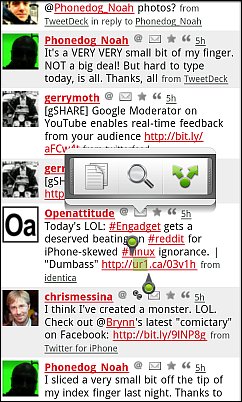
A usability issue with opening links in a new window. In the latest version of Sense, HTC has implemented a very nice way to select text image . A long press on the screen brings up a neat text selection widget (image above, right) that lets you easily define a block of text and then copy it to the clipboard, share it in an email or on Twitter, etc. or use it as a Wikipedia search query. It works great, much better than the error-prone way text selection is done in standard Android. Unfortunately it also makes it difficult to open a link in a new window. In Android a long press on a link normally brings up a context menu that includes the option to open in a new window. But with the Evo browser, a long press usually bring up the text selection widget instead of the context menu. I can generally get to the context menu on the third or fourth try but it’s rather frustrating. I open links in new windows far more often than I copy text. I wish I knew what heuristics Sense uses to determine whether to display the menu or the text selector. Whatever it is, it doesn’t work worth a damn. Plus the browser’s context menu also includes a “select text” option that launches the HTC text selector, so there is really no need to have a long press do anything but invoke a context menu. Having a long press invoke the text selector is redundant and spoils the user experience by blocking a core browser feature, the context menu.
In spite of these few annoyances, I still consider the Evo’s Browser, along with MicroB on Maemo, to be one of the two best browsers on any phone. I’m sure it will only get better.
Thanks! Very well written and I have found that turning off some of the apps (that come standard on the phone) that I will never use, ex: Nascar app, stock app, Amazon Mp3 app, etc have improved my battery life dramatically. I also turn the screen brightness level down to 50% when I am in my long 3 1/2 hour class and that also helps the battery life. As far as the browser, I am impressed and love, love, love my Evo!
The Mugen Power Batteries website just update the extended battery for HTC Evo,
http://www.mugen-power-batteries.com/mugen-power-extended-battery-for-htc-evo-4g-1800mah.html
have to get the 1800mAh for more battery life for my Evo, hope it can improve more time for me using it.
the original battery life time terrible!
http://www.blackweb20.com/2010/06/08/are-the-iphone-4-and-htc-evo-4g-evenly-matched/