WOMWORLD/Nokia lent me the new T-Mobile Astound (aka Nokia C7) which I’ve been using as my main device here at CTIA for the last 36 hours. Here are my impressions.
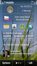
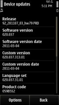
The most exciting thing about the C7 is brand new firmware. It’s custom firmware for T-Mobile that’s “almost” PR 2.0 in that it has most of the features of of the much anticipated PR 2.0 firmware for Symbian^3.
The Nokia reps I’ve spoken to insist that the new firmware isn’t PR 2.0. But it has many PR 2.0 features including the new browser, split screen keyboards, portrait QWERTY, smoother homescreen transitions and new email and social apps.
The browser is version 7.3.1.20 and is a complete rewrite that fixes most of the pain points with the Symbian browser. Highlights for me are:
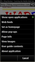
- Multiple window support. You can open a new empty window from the Window menu or open a link in a new window with a long press.
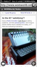
- The on screen back button and reload/stop buttons are always available rather than hiding behind the menu button.
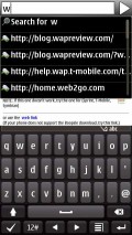
- URL auto completion.
- No more tiny, thin fonts. The minimum font size seems to have been increased slightly and the smaller fonts are bolder and much more readable.
The email app has also received a major redesign. Changes I saw are:
- In the list of emails unread ones are displayed in bold rather than by an unopened envelope icon.
- Messages download and display much faster
- Improved fonts as in the browser.
- The broken images bug where images would not be displayed in subsequent messages after reading a few image-rich HTML emails seems to be fixed.
But the biggest differences is that using Mail for Exchange with Gmail is now fully supported. The annoying “Security policy that allows downloading HTML messages is disabled” error message is gone and sending and replying works. So far I’ve found the MfE, Gmail combination, which provides true push email, to be reliable and fast.
Hardware wise, the C7 is one of those devices that’s much nicer in the flesh than it looks in press photos. The materials are top notch with a metal battery cover and a wide metal bezel around the glass screen. The 8MB EDOF camera seems identical to the one on the E7. It takes quite good pictures as long as you are at least three feet from your subject but there’s no macro mode. Where the C7 camera really shines is in videos which are 720p HD and look quite good.
The Astound, which is targeted at first-time smartphone buyers will be available April 6th For $79.99 after a $50 rebate on a two year contract. It is also available for pre-order now for $79.99 with no rebate required. The off contract/prepaid price is expected to be around $280. The Astound supports T-Mobile’s UMA WiFi calling feature. Unlike the E73, the UMA feature is can be enabled and disabled. Preinstalled apps include Sports Tracker and Slacker Radio.



That is goodies…
I have a question on you website,Are your Services able backup provide support manfuacter passback on my Local “Middle East” “Iran mazandaran Amol” by GrandGlobalGearGrassGlass named “USAMOL”
I have no idea what you are talking about. Also, the Google Profile link you posted as your website is invalid.
@Dennis yeah 3 consec. double-taps did toggle zoomed in and fully zoomed out view until the second or maybe third to last firmware update on my Nokia 5800. I accidentally figured it out and it was sort of hit or miss. Any sort of easy way to zoom in/out is in my opinion very welcome. At some point I used what was called @digia browser, which I believe was just an overlay on the s60 browser. It was not perfect but made possible to zoom relatively easy in 25% increments.
T-Mobile is great and I am discouraged what AT&T may do with it. I like this site work between switching it up on mobile. I tried Mobile Pack and had a rough time figuring it out.
Also, with so many browsers out there you wonder how this will all shake out for the mobile web. I listed your site on my blog on the resources page.
Hello Dennis,
Thanks for the insights. Much appreciated.
You mentioned that the browser is a ‘complete rewrite’. Would appreciate some more info on that. There are those who claim that this is just a facelift and that there are no real performance improvements.
Gracias.
Well re-write is relative (nobody ever rewrites every single line of code in any sizable app) and I used that term loosely. I’m sure there is some legacy code. But I’m seeing significantly better JavaScript performance and HTML5 support in the new version so the rendering and JS engines are updated if not completely new. I’m working on a post on the performance changes. It should be up this weekend.
I really hope Nokia finally made the browser defaulting to page overview when a new page is opened instead of showing the upper left corner only in this last iteration of the browser. If they didn’t I hope they at least re-enabled 3 consecutive double-taps that would activate the page overview. I really like symbian but it is the browser that made me switch to android like a year ago.
It’s the same as before, pages open zoomed in. Personally I prefer it that way. I never look at the page overview except in the rare case of a site that’s so badly designed that it’s the only way to figure out where the main content is. It would be nice if Nokia provided a setting to toggle the behavior however.
I’ve never heard of 3 consecutive double-taps ever switching to page overview in any Symbian browser. That’s a lot of taps. Pinching, which gets you to page overview with a single gesture seems much easier.
its a nice mobile phone!