 Bay Area Rapid Transit (BART) is rail transit system in the San Francisco CA (USA) Bay Area. BART recently introduced a wireless version of their online trip planner. Transit schedules and trip planners – like driving directions and city directories are ideal mobile applications. I think it would be absolutely wonderful if I could bring up a tool on my phone that would let me find the best way to get somewhere on transit particullarly in a city I wasn’t familiar with.
Unfortunately, mobile transit tools especially good ones are rare. London has a great WAP based trip planner. For Palm and Windows PDA’s and Symbian Smartphones there is a very good native app called Metro which covers over 300 systems worldwide.
I was excited about the possibilities of BART’s planner. Unfortunately, although BART’s web site says it’s for your “mobile phone or PDA”, BART’s effort seems to be designed for devices with a large touch screen rather than the typical phone. Why do I say this? Well there’s a 375X375 px System Map 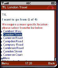
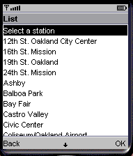
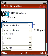
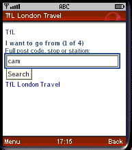 which is a bit too big for most phones. But that’s not the worst part. Take a look at the second image. That’s what displays on the phone after I’ve scrolled to and selected the “From:” dropdown. Doesn’t look too bad, all I need to do is scroll down and select the station I want – right? Not really, BART has 43 stations, so if I’m at the last one, West Oakland I have to click the “down” button 43 times on most phones. Compare with how London’s TFL site does it. I enter either the Postal Code or the first few letters of the station name and I’m presented with a short list of possible stations. Conventional wisdom about designing mobile pages says that forcing users to type letters and words on their phone keypad is bad, as a signifigant percentage of users simply won’t. But the solution BART used is far worse. An ideal design might be to have the use first pick the city or choose from a list of a-e, f-j and then present a much sorter list of only those stations meeting the initial criteria. Dropdown lists are also less usable on phones than a simple list of links – with numeric access keys if the device supports them.
The results pages for both sites are very similar except that the London site includes a notice of temporary problem with the escalators at one of the stations. BART doesn’t appear to give any indication of service disruptions. I choose a destination station, Rockridge where one of the main entrances is closed for a month for repairs forcing users to cross the street and take stairs and a pedestrian bridge to get into the station. The power of the web is that it can display real-time information about just this sort of problem. 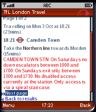
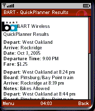
Note that BART already has a native mode trip planner for Palm and Windows PDAs that looks and functions almost identically to the wireless version but uses a local database rather than data access. I don’t know why anyone with a supported PDA would use the wireless one when the native app is faster, works even when there is no cell signal and won’t incur data charges. The data only changes when the schedule changes, typically one or twice a year, so why doesn’t BART make a Java ME version for phones rather than a WAP one?
Finally, I don’t want to give the impression that I’m picking on BART specifically; they deserve credit for trying to embrace mobility. Hopefully critiques like this will encourage better mobile site design. I’m afraid that there are a lot more bad mobile sites than good ones today. This can and I believe this will change as the mobile web becomes more popular and good design practices for mobility become more widely expressed.
Content: ![]()
![]()
![]() Usability:
Usability: ![]()
![]() html
html
Does the bay area transit system need its own classified ad website?
Transit Bay Area Classified is a website dedicated for public transit where viewers can find resources from the many sections on the site.
Save time and gas by dealing with people you commute with everyday to buy sell or trade.
http://www.transitbayareaclassifieds.com/dontfollow