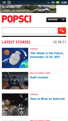
The latest revision of Popular Science magazine’s mobile site at m.popsci.com sports a searchable blog style timeline of recent articles and photo features from the publication’s desktop site. The site is attractive and the content is great, but usability is hurt by a couple of non-functional page elements that invite the user to tap them but end up doing nothing. For example, there’s a “Browse” dropdown at the top of every page and a similar “Comments” dropdown at the end of each article. Neither of these dropdowns respond to taps or clicks in any of the browsers I tried which included the Android Gingerbread browser, Opera Mini 6.5 and desktop FireFox and Chrome.
Popular Science is a 139 year old US based monthly print magazine covering all areas of technology from a layman’s perspective. The emphasis is on automobiles, electronic gadgets and earth and space science. Articles are generally well researched and profusely illustrated. In addition to the print magazine, mobile and desktop web sites, Popular Science publishes a digital edition for the iPad that is one of the top sellers in the App Store.
Filed in: Wap Review Directory – Tech
Ratings: Content ![]()
![]()
![]()
![]()
![]() Usability
Usability ![]()
![]()
![]()
![]()
![]()
Mobile Link: m.popsci.com

Great app! Thanks for sharing.
ATTENTION: MR. DENNIS BOURNIQUE
Problems:
1)Your DESKTOP VIEW” looks the same as your “Mobile view”.
(Your “Desktop” link didn’t work).
2) YOUR LINKS (IN BLUE) DON’T WORK – tried a few, one of them “POPULAR SCIENCE”
3) CNN.COM (http://cnn.com) REFUSES to stop redirecting me to their crappy MOBILE version.
Their Landing page has NO LINK for “Desktop View/Full View”
*** Any solutions / advice please?***
My setup:
Phone: Blackberry Curve 9300
OS: 5.0.0.846
OperMini hifi cuemoth en-za 4.5.33868, 20130625
BEST version (EVER)
OperaMini 4.2.13337 used on my Nokia N95 for 5 yrs
(UNTIL Opera STOPPED SUPPORTING IT).
I’m continuously wondering how many people out there believe:
IF IT AINT BROKE, DON’T FIX IT –
I certainly DO.
Thanks for your newsletter
and tips.
Chaz
This site’s desktop and mobile views do look similar but they are different. The mobile view is much “lighter” (54KB vs 332KB).
The desktop view is a responsive web design that reflows the page so it fits all screen sizes without horizontal scrolling. On narrow screens, the right sidebar containing the search box, recent comments list and categories list is repositioned below the main content.
I tested the “Mobile Edition” and “Switch to our desktop site” links as well as the “Popular Science” link and both m.popsci.com links in this post using a Nokia N8 with both Opera Mini 7.1.32444 for Symbian and with Opera Mini 8.0.35158 for Java. All the links worked the first time and everytime I tried them in both browsers.
If links aren’t working you are probably hitting the long time Opera Mini bug where clicking a link reloads the current page rather than going where the link should. I think the Opera servers do that when they are overloaded. When that happens using the “Open in New Tab” long press option usually works correctly for me. Using a more recent Opera Mini version might help too. I’m sure lots of bugs have been fixed since 5.0 and 4.2.
There no longer seems to be any way to force CNN’s desktop view in Opera Mini.