 There are so many new mobile sites lately. A year or two ago I’d be lucky if I found a review-worthy new mobile site every month. More mobile sites were shutting down than opening up. That has all changed. I hear of a new site literally every day. I’m hoping to keep up with the flood with more but shorter reviews.
First off, the New York Times. You won’t get much argument, The Times is the US’s best newspaper. I know, newspapers are becoming irrelevant – but The Times is an American institution, an icon. It also has had a harder time adapting to the internet age than most media outlets. Almost alone among web news sites The Times has enforced a subscription model for it’s most valuable resources – it’s archives and some of it’s columnists. I think that charging for news on the internet where information is free was a mistake that kept the Times from becoming THE web news site. The Times has particularly struggled with the mobile web. There are multiple Times mobile sites, both official and unofficial, all of which seem slightly flawed. Here are the ones I know about
- www.nytimes.com/wap/ launched in 2003, is a strange caricature of a news site. The “stories” on this WAP1 (wml) site are a single sentence followed by the words “For full story visit www.nytimes.com.” I guess someone who is paying by the KB and just wants to scan headlines might find this useful but why not at least provide a link to the full article!
- partners.nytimes.com/avantgo/main.html – Apparently intended for offline reading using the the Avantgo.com service. Unlike many Avantgo sites this one has a public url, making it usable on devices that don’t have an Avantgo client. It’s actually pretty good, if limited – consisting of the full text of about twenty top stories from the News, Business and Technology sections.
- 206.130.125.128/ This is one of the “Mobilized by Unified Mobility” sites that I wrote about in Wow 31 New Mobile News Sites! This was a good site for a while with the full content of hundreds of articles from over a dozen sections. I bet this was a demo put together to try to sell The Times on using Unified Mobility’s services. It must have been no sale as most of the headline links currently lead not to stories but to a registration required type message. Unfortunately, there’s no way to register or login through the Unified Mobility site.
- nytimesriver.com The Times River was created by Dave Winer based on his River of News concept. I like the river in principle but there is a problem with this implementation. The site is just two darn big for the majority of mobile phone browsers. Dave has a Blackberry which the River works fine on. It should also be good on a Palm, Windows Mobile or Symbian PDA or Smartphone. But Smartphones are only 15% of current phone sales. The majority of mobile browsing is done with mainstream phones which have severe memory limitations. The River’s front page is 74 KB – popular phones like the Motorola RAZR which has a big beautiful screen ideal for news reading, can’t handle pages much over 20 KB. There is also the issue of data charges. In the US, unlimited data is cheap but not so in most of the world where you pay by the KB. Checking the River every hour or two could easily run $10/day on some of the metered plans.
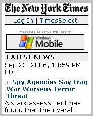
- mobile.nytimes.com is a new site launched this month. It’s probably the best of the lot for most users but for one flaw. On the positive side there are hundreds of articles from all sections, good navigation with accesskeys and the menu at the bottom where it should be. It even has a first for a Times mobile site – news photos! So what’s the flaw? For some unexplainable reason the site designer enclosed all the pages in a centered, fixed width div block. Browser detection IS used to vary the width of the div to match screen width. I initially though the width was fixed at 176px because when I switched user agents with a Firefox extension nothing changed. I found I had to clear the session cookies to get the site to recognize a new user agent. Browser detection can never be perfect and if your phone is not recognized you may end up with a page that’s too wide or narrow – check out the image of the Times site on a Nokia N80 over at Eugenia’s blog demonstrating this. I don’t see what the point is, if no width was specified any browser would flow the content to fit the screen and the end result would look identical but would work on 100% of devices. Browser detection for image widths makes sense but not for framing text that doesn’t need framing.
There you have it. Hopefully at least one of these versions of the Times will work on your phone. My recomendation is to try the River if you have a smartphone otherwise start with the new mobile.nytimes site and if that doesn’t work on your phone the Avantgo one should.
Mobile NY Times: xhtml-mp
Content: ![]()
![]()
![]()
![]()
![]() Usability:
Usability: ![]()
![]()
![]()
Related:
- There are links to all the NY Times sites on YesWAP.com under News/NY Times.
- More Wap Review News Site reviews
Pingback: MobileRead