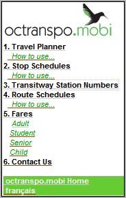
 Ottawa’s transit agency, OC Transpo, recently launched a mobile transit site at octranspo.mobi. The mobile site is being promoted with a prominently placed ad on the agency’s full web site that links to a page with a description of the service and instructions for it’s use. The instructions seem to be targeted at people who have never used the mobile web. The mobile site itself is intuitive enough that most users should have no trouble using it without having to refer to the instructions.
The site is offered in English and French and has four main functions:
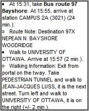
- Travel Planner: Enter start and end points, date and time of day and the planner returns trip instructions including detailed turn by turn walking directions (2nd image) to and from the bus stops. Points can be entered as an address, intersection, bus stop number or by choosing a landmark from a list
- Route Schedules: Enter route number, chose date and approximate time of day, direction and up to three stops from a list to view a schedule.
- Stop Times: Enter bus stop number, chose date and approximate time of day and up to five stops from a list to view all scheduled bus arrivals at that stop. Stop numbers are posted at bus and train stops.
- Fares: Complete list of all OC Transpo fares and passes with prices and restrictions.
 I found octranspo.mobi easy to use on a variety of handsets. Page sizes are small making the site responsive even on slow networks and low end phones. The route planner’s directions are very clear and detailed.
There are a few areas where minor changes would make the site’s already very good usability even better.
- Access keys are used on the home page for one click navigation. I’d like to see them added to the navigation menu at the bottom of each page.
- The “Fares” section is only linked from the home page of the site, the main menu doesn’t have a link to it or back to the home page. Once you drill down into the site, the only way to get to “Fares” is by pressing “Back” multiple time to reach the home page.
- The site uses tables extensively. Although tables are considered a bit of a no-no in mobile design they actually work quite well on this site – except in the route schedules. If more than one stop is chosen a multi column table to be used to display the schedule times. On phones with a screen less than 320px wide, the table will either wrap or require horizontal scrolling. Listing the times as unformatted text, three across, while not as attractive, would be more usable.
- In the trip planner, intersections have to be entered with an ampersand “&’ between the two streets (the online help incorrectly shows a commercial at sign “@” in the example which will not work). I’d like to see “and” excepted as an alternative as it’s more intuitive and on many phones it takes fewer keystrokes to type than “&”.
I don’t know who designed this site, but I’d rate it as one of the better mobile transit sites I’ve seen. The site is responsive, click paths and data entry options are nicely optimized for mobile and the site returns exactly the sort of information a user needs when navigating public transit. Transit is a natural for mobile, it’s a shame more public transit sites aren’t as well designed as this one.
Via: Mobility Mobi
Mobile Link: octranspo.mobi
Ratings: Content: ![]()
![]()
![]()
![]()
![]() Usability:
Usability: ![]()
![]()
![]()
![]()
![]()
Filed In: Travel-Transit/Transit