 Updated 12-Dec-2008 Added clarification of how the MoFuse plugin works.
In the jargon of mobile web development “thematic consistency” means that if you visit the same URL with different devices you should see more or less the same content. It may be formatted differently, images may be smaller or missing and long pages split up when viewed with a mobile browser, but the essential theme of the page should be the same on all devices. For example, if you write an article about dogs that appears at example.com/dogs, mobile visitors to that address should see your words about dogs not an article on cats or your mobile site’s homepage.
Thematic consistency is what makes links between sites work in a predictable manner and sharing bookmarks across platforms possible. When thematic consistency is not followed the result can be a frustrating user experience – like the one I had yesterday. On Twitter, I saw a Tweet from dotMobi’s James Pearce mentioning that delicious.com now has a mobile version. James included a link which points to a story on Mashable.com:
mashable.com/2008/12/09/delicious-finally-jumps-on-the-mobile-web-fad/
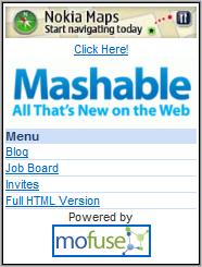
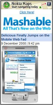
When I clicked the link in my mobile browser, instead of seeing the Delicious story, I ended up on the site’s mobile homepage (first image). After a couple of minutes of clicking around on Mashable Mobile, I finally found the Delicious article (second image). The same thing happened with a link to any Mashable item using Opera Mini, UCWEB or my phone’s built in WebKit based browser.
 It gets worse though. All of the mobile browsers I tried are actually capable of viewing the full-web version of Mashable. There’s a link labeled “Full HTML version” on the mobile Mashable homepage. I clicked it and was transported to the full Mashable.com homepage. Not what I wanted but at least consistent. So I scroll down the page a bit and start reading an item. The items on Mashable are excerpts, you have to click a “Keep Reading” link to continue. Except that when you do so, Mashable’s brain dead mobile redirection dumps you back on the mobile home page again!
Many sites do deliver mobile content with thematic consistency. It’s not that hard, especially for sites like Mashable that use WordPress. There are at least three WordPress plugins (From Alex King, Andy Moore and Mippin) that will create a mobile version of the site and retain thematic consistency. It looks like Mashable is using MoFuse to create their mobile site from a feed. Mofuse has a WordPress plugin that does not appear to support thematic consistency. I don’t know if Mashable is using the MoFuse plugin or redirection code of their own but the end result is that all mobile requests for any Mashable page are redirected to the mobile homepage at m.mashable.com. This means that every link to any Mashable page except the home page is effectively broken for mobile users. Links on the web, in feeds and on Twitter, Jaiku, etc., – all broken. In defense of MoFuse, it does a fine job of creating a mobile site, but for anyone using the Mofuse WordPress plugin, I recommend turning the “Automatic detect and redirect” feature off as it breaks thematic consistency.
Update: See comments from MoFuse’s David B. and Pete from Mashable below. The Mofuse Plugin does not break thematic consistency, if it can’t supply a mobile formatted version, it passes the request to the original full-web resource. Mashable is apparently not using the plugin and they are working on a fix which is good news indeed.
I like Mashable, it’s one of my favorite tech news sites and has a lot of mobile web related content although I wish they wouldn’t call the mobile web a “fad”. I gave the Mashable mobile site a favorable review when it first came out. At the time of that review the site did not redirect to mobile at all which, while not ideal, is a lot better than what they are doing now.
So what should developers do when creating a mobile site that mirrors all or some of the content of an existing full web property? I think there are three acceptable approaches. In order from most to least desirable which also happens to be from hardest to easiest, unfortunately, they are:
1) If possible, support thematic consistency by offering mobile versions of equivalent content on the same URL. Where a mobile equivalent doesn’t exist, give the user the option of seeing the content in the original non-mobile format. This can be done with an interstitial page saying something like, “The page you requested does not exist in a mobile formatted version. Would you like to view the original?”
2) If full thematic consistency is not practical, redirect mobile requests for your full site’s homepage to the mobile homepage. Let requests for other pages fall through to their full web target. Not as user friendly as 1) but at least you aren’t breaking links.
3) Do not redirect mobile browsers at all. Build your mobile site on its own independent URL, preferably using something recognizable as mobile like a .mobi domain or m. subdomain. Promote that URL on your non-mobile homepage.
If you are using redirection, mobile formatted pages should contain a link allowing mobile users to view the full-web version of that content if one exists. Once the mobile visitor switches to the full-version that switch needs to be persistent throughout the current session. The user asked for non-mobile formatted content, clicking a link on the full site should not dump them back on the mobile site.
Thematic consistency is a wonderful thing for mobile, it’s the magic that makes linking work. Implement it if you can but above all don’t break it.
Update 4-Aug-2008: Today I again happened to follow a link from Twitter to a Mashable story on my phone and was pleasantly surprised to find that I was taken directly to the proper page rather than to the Mashable mobile homepage. It wasn’t a mobile formatted version but that wasn’t a problem as I was using Opera Mini which handles the desktop version of Mashable reasonably well. So it look’s like Mashable has chosen to make their site thematically consistent by no longer redirecting mobile browsers.
@David B.
Thanks for the comment. I’ve updated the post to clarify how MoFuse works. Let me know when the plugin is updated to support deep linking so I can help spread the word.
Dennis
We’ve (MoFuse) been working on this for a little bit now and sooner rather than later this won’t be an issue any more.
The PHP code we provide to our users to put into their sites does not break the URL be default. It checks to see if the viewer is trying to access the homepage of the blog, if it is trying to access a deep link that we don’t have a mobile version of, we do not display the mobile site but rather the full HTML version of the link.
We’ve been providing that support for about 8 months now.
It’s not mandatory for users to use our PHP code or our WordPress plugin, they are free to create any adaptation they want.
But like I said before, we’re working on an extensive project that will completely solve the deep-linking problem.
@Pete,
Great news. Please let me know when it’s fixed so I can post an update.
Dennis
Dennis,
Totally agree that this is annoying and non-intuitive. We’re working on a fix.
I agree Dennis on your words.I never liked mobile detection conspiracy for the mobile version of a full desktop site,both versions located on the same url.Things should be clear and having an m.,mobile. or .mobi is a lot more user friendly.Sadly enough,Mofuse does not archive posts for blog.Mippin does so and certainly gives better results.
One more wordpress plugin that I came across is MobilePress.
http://mobilepress.co.za
Mobile Messaging 2.0 is using this plugin.It is geared towards smartphones and looks very very good.
I’m not too bothered about the ‘fad’ thing. It’s a word that will come back to haunt the author :-)
Regarding redirects, browser detection and user choice, I finally completed part 2 of my switcher algorithm (aka how you might actually do this in code)
http://mobiforge.com/designing/story/a-very-modern-mobile-switching-algorithm-part-ii
HTH, JP
Pingback: Posts about WordPress Plugins as of December 11, 2008 | The Lessnau Lounge