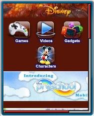
Disney’s official mobile site looks like lots of fun for children of all ages. There are free online games, movie trailers, a “Radio Disney” channel featuring teen-themed music and much more including a special page of games, activities and videos just for preschoolers. On the practical side the site also has TV schedules, Disney on Ice tour schedules and information on Disney theme parks.
The coolest feature is probably the personalized Disney character voice tones generator. It lets you create ringtones with Tigger, Mini or Donald speaking your child’s name and other customizable information like a favorite food.
However there are some things about the Disney site that seem poorly thought out. Radio Disney uses a voice call rather than using streaming media so the sound quality is awful. I’m also not impressed with the site’s adaptation to the huge variety of mobile devices in the market. There is some attempt made to adjust page and image sizes to browser capabilities but the minimum page size seems to be about 76 KB. The big, image and JavaScript heavy site does work reasonably well on my Android phone and Nokia N95. However, I’m pretty sure that it’s too large to even load on most of the low end prepaid feature phones I see kids carrying. Plus the page layout seems optimized to 240×320 or larger screens and doesn’t scale well to smaller ones.
Filed in: Wap Review Directory – Entertainment
Ratings: Content ![]()
![]()
![]()
![]()
![]() Usability
Usability ![]()
![]()
![]()
![]()
![]()
Ready.mobi Score: 2 “Bad”
Mobile Link: m.disney.go.com
Hello Dennis,
The pages of Disney mobile do scale down for phones of smaller screens and so do the images and icons.But yes,the site interface is not very user friendly,particularly for kids.The scaled down icons are painfully small and their fonts are practically indecipherable.Disney seems to rely heavily on images to create menus.I think it is a blunder to do so from a perspective of flexible design.