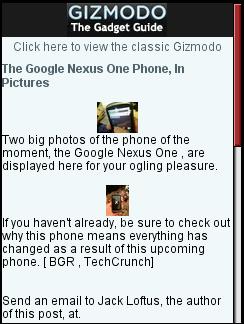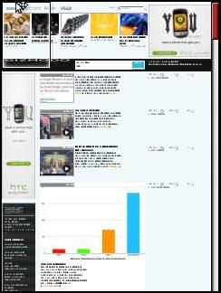

I was reading Twitter the other day using Mobile Tweete in Opera Mini 5 on my N95. This was at the start of the “Google Phone” ruckus. I saw a tweet by @ScottSeaborn linking to some of the first published photos of the Nexus One on Gizmodo. Clicking the link took me to a mobile formatted page “powered by Quattro”. The photos on the mobile page were so tiny that I got no sense of what the phone actually looked like. No problem I thought, I’ll just go to the full version of Gizmodo to see the original images. There was a handy “Click here to view the classic Gizmodo” link at the top of the page which I clicked. Imagine my surprise when I landed on the Gizmodo homepage with no sign of the Nexus One story which had already been pushed off the front page by newer items.
Besides the tiny images there are other things missing on the mobile page too like the ability to leave a comment. Delivering a mobile formatted page to mobile browsers is great but it should also be easy to reach the full version of the content if desired.
The “classic Gizmodo” link on mobile Gizmodo is pretty worthless. I had followed a deep link to the desktop version a specific page of content. Gizmodo/Quattro detected a mobile browser and helpfully delivered a mobile formatted version. If I find the mobile version too limited, I almost surely want to see the original version of the same article, NOT the homepage!
To me this is an aspect of mobile thematic consistency. It’s good to offer the user versions of content formatted for various devices but links between them need to deliver the same core content, not an unrelated pages.
As for the Google phone, the phone itself is real. The $199 unlocked price and $29/month pre-paid unlimited data plan with unlimited VOIP calling are nothing but unsubstantiated rumors at this point. I hope the rumors are true but I’m skeptical.