There’s a lot of buzz these days about how “touch web” browsers, especially the iPhone’s Safari, but also the WebKit based browsers on Android, Palm WebOS and recent Symbian devices are revolutionizing mobile browsing. It’s certainly true, especially in the US and other developed countries, that advanced smartphones with powerful “full-web” browsers have opened a lot of eyes to the fact that using the Web on mobile phones is not only practical but fun and useful.
But not everyone can afford an iPhone and the expensive data plan that it and other smartphones require. And the iPhone’s great browser is not so great on slow GPRS or even Edge networks. If you look to the developing world you won’t see many iPhones. In the US prepaid market you won’t see any at all. In places like Africa, India and the Philippines millions of people are using and enjoying the “touch web” and the full web on slow networks with basic feature phones or old smartphones. They are using Opera Mini, a great little Java ME browser that runs only almost any phone. Opera’s server assisted technology reduces page size and bandwidth by up to 90%, saving money of metered data plans and making even large pages load quickly on creaky networks. It’s not just the developing world either, Opera Mini is popular everywhere. It’s usage is growing rapidly with over 50 million people using it every month! That’s bigger than the iPhone’s estimated installed base of about 34 million devices and close to the combined iPhone plus iPod Touch total of 58 million.
With Opera Mini being as popular as the iPhone, you would think that it would be on every mobile web developer’s radar and that sites and web apps would be tested on and optimized for Mini as they are for the iPhone. Strangely the opposite seems to be true. While Opera Mini can render almost any site, many pages do not look their best in it. The biggest culprit is pages that are designed to fit screen width on the iPhone and other touch web browsers but overflow the window and require horizontal scrolling to see the whole page in Opera Mini. Here’s are a few examples:


The culprit is often wide images, especially header banners. In many cases, the fix is as simple as one line of CSS: style=” img {max-width:100%;height:auto;}” I don’t recommend hard-coding that into the page though as Mobile Internet Explorer and some other browsers will resize image width but not height resulting in skewed images. It’s easy enough to detect Opera Mini, every version sends “Opera Mini” as part of the User-Agent header.
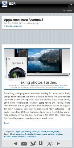
Mobile web designer’s ignorance of Opera Mini goes beyond delivering less than perfect layout. In some cases, entire sites are totally broken in the browser. Two major mobile focused sites, Boy Genius Report and IntoMobile actually serve pages to Opera Mini users that are devoid of any content! Both sites detect Mini and send it a supposedly mobile optimized view of the site. The only problem is that the entire body of every single post on both sites is missing when viewed in Opera Mini. The image on the left shows how BGR looks in Firefox when using the User Agent Switcher extension to impersonate Opera Mini. On the right is BGR in the real Opera Mini.


I’m not sure what is wrong with these pages that causes the post bodies to disappear. The html for the bodies is present in the source code but somehow it’s getting hidden, probably by some broken CSS or Javascript. The only way to view the posts on these sites is to go back to the front page and hit the button that lets you turn off the default mobile theme. The desktop version of BGR works fine in Opera Mini.
Update: a few days after this post was published IntoMobile fixed their site, which had been broken for months, and it now works perfectly with Opera Mini.
It’s pretty obvious that the people who built these sites never once tried viewing them in Opera Mini!
If you create web sites for mobile or desktop, please do 45 million Opera Mini users a favor and test your pages in it. Not only is it good for the users, but it ought to give your page views a shot in the arm as well. It’s not that hard, Mini runs on just about any old Java capable phone. And while I don’t usually recommend testing with mobile browser emulators, you can run the actual Opera Mini code in MicroEmulator on a PC. Microemulator even has a re-sizable device skin that lets you quickly test with various screen sizes.
Incidentally renowned web design consultant PPK (Peter-Paul Koch) published a piece yesterday titled “The iPhone obsession” which is all about the folly of designing sites only for the iPhone. It should be required reading for everyone working in mobile.
Opera Mini is broken like hell! Dolphin must use the same core because it stretches out pages vertically just the same. What is it mobile FireFox, Chrome and MetroWeb gets it right? Opera Mini full of “chit” and you can’t expect developers to stress to the coffin over Opera Mini’s poor development and poor excuse for a mobile browser!
Well I am trying my best here. Since mobile-dev is most likely the future. But really wished there was a way to Force-DISABLE Mobile View via HTML – via some Javascript function or Meta tag.
For example, this site I am working on looks nice but ONLY IF – Mobile view is disabled. Otherwise it looks super horrid.
Opera Mini will disable mobile view if it recognizes that the page is mobile optimized,which it will do if ANY of the following is true:
1) CSS has media handheld:
2) Page has this meta tag:
3) Page has a a mobile doctype (xhtml basic or xhtml-mp)
Pingback: Is Opera Mini 5 the New Game Changer? | Tools | instantShift
I agree with this. A lot of websites are only recently starting to wake up to the potential of the mobile users and still Opera Mini is not on their priority list. I hope their attitude changes soon and they fix this so they will get more traffic from mobile users.
Opera Mini is meant to convert web pages into a phone friendly format. If wide banners require horizontal scrolling that’s because Opera Mini fails to resize them to fit your screen width. If text that’s visible in a normal browser is invisible in Opera Mini, it is because Opera Mini fails to convert it properly for mobile view.
When a website is not properly converted for your phone screen by Opera Mini’s proxy server, you should blame Opera Mini instead of the webmaster.
If Opera Mini disables mobile view for sites with the handheld attribute by design, then Opera should stop doing that. Instead, they should let the user decide whether mobile view is on or off.
Hello, well i’d like to know why i never have this problem with Opera Mini 3. And the most frustrating thing is the fact that i have to see and use the “mouse” to navigate some time while mobile view is activate.
If you mean pages not fitting to the screen, they always fit with Opera Mini 3 because the browser doesn’t have a desktop mode and is incapable of scrolling sideways.
The newer versions of Opera Mini will disable mobile view on sites that have a style sheet with the attribute media=”handheld”. I don’t like that as it forces horizontal scrolling on many sites. But it is by design and is unlikely to be changed.
You have made a very good point there. Thanks.
Great post! I love how looking at the numbers can realign ones perspective. PPKs blog was great too, I never would have seen the similarities between Webkit and IE6 !
The intoMobile bug is a WPtouch theme issue, I’ve been to a lot of sites that use it and all display the same. I guess it was only tested on a iPhone which is a shame cause it could be great on others too