I’ve been using my N8 a lot lately and because the Symbian^3 browser is so bad (slow, too small default fonts and no text-reflow on zoom) I’ve been using Opera Mobile 10.1 quite a bit as well. It’s a much better browser overall; it’s noticeably at faster loading complex pages, has tabs, lets you copy page text, has some HTML5 support including geolocation and text is supposed to reflows to fit the screen width.
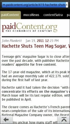
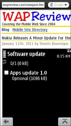
But I keep running into pages where Opera Mobile on the N8 does not wrap text as I think it should. The problem only seems to occur with made for mobile sites. It affects some big names including the mobile editions of Yahoo, ESPN, Wired, paidContent, Mashable and ReadWriteWeb. It was also affecting the mobile edition of WapReview, wapreview.mobi (image below, left) which motivated me to find the cause and a fix.
I ran some tests and and discovered a strange interaction between a page’s doctype and the <meta name=”viewport” content=”width=device-width” /> tag.
My key finding was that if a page has a mobile doctype (xhtml basic or xhtml-mp) and also has a viewport meta tag specifying “width = device-width”, Opera Mobile 10.1 on Symbian only wraps text at the screen boundary when the browser’s zoom level is set to 100%.
The viewport width=device-width meta tag tells the browser to fit the page to the screen width. Without it the iPhone and Android browsers assume that the page is designed for desktop browsers and display it as a tiny rectangle in the top left corner of the screen that the user must zoom into to use. Opera Mobile also does the same thing “most” of the time
If there is no doctype or a “desktop” doctype like HTML 4 or XHTML 1.0 Strict or even HTML5, text wraps at the screen boundary in Opera Mobile at all zoom levels regardless if there is a viewport meta tag or not.
But switching to a non-mobile doctype (or HTML5) isn’t a complete fix. Even with a non-mobile doctype, the viewport meta tag seems to cause problems with Opera Mobile for Symbian. On wapreview.mobi I’ve set the max-width of images to 100% in CSS. My expectation is that this will keep images from extending beyond their container’s (the page) width. The images are the only fixed-width elements on the site so by re-sizing them to page width or less, the page should always fit the screen width with no horizontal scrolling or scroll bar.
The combination of max-width = 100% and viewport = device-width does work as expected with Opera Mini, the Android browser, the Symbian 3rd ed browser and with Opera Mobile on Android. But in Opera Mobile on Symbian with max- width = 100%, images are not restrained to their container’s width when the page is zoomed, if the page happens to have a viewport width=device-width meta tag.
What Symbian Opera Mobile appears to be doing is rendering the page to fix the 360 px wide device-width at 100% zoom. Then when you zoom to 160% it incorrectly assumes that the device-width has increased to 160% of 360 or 576px and fits the page to that width! Of course, the actual device width has not changed so nothing fits.
If you’re confused, and you should be, perhaps this matrix will help make it clearer:
| Opera Mobile 10.1 on Synbian^3 | Initial View | Text Wrap | img max-width = 100% |
| mobile doctype and viewport meta tag | zoomed in | broken | zoomed images overflow page width |
| mobile doctype, no viewport meta tag | zoomed in | OK | zoomed images don’t overflow page width |
| desktop docktype and viewport meta tag | zoomed in | OK | zoomed images overflow page width |
| desktop doctype, no viewport meta tag | zoomed out | OK | zoomed images overflow page width |
Note that the only time Opera Mobile gets it right is when there is a mobile doctype and NO viewport meta tag. The browser seems to take the mobile doctype as a hint to display the page zoomed in with text fitting the page width regardless of the user selected zoom level, just as the viewport meta tag is supposed to.
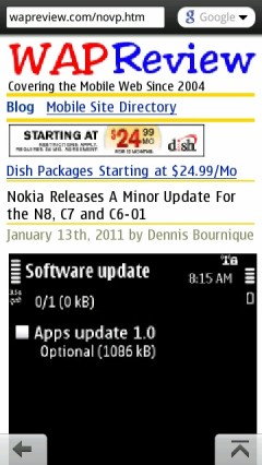
With that discovery, I was able to fix (image above, right) wapreview.mobi by using the xhtml-mp doctype and removing the viewport meta tag if the browser is Opera. With that configuration text and images fit the the screen dimensions perfectly in Opera Mobile on all the platforms I tried and also with Opera Mini 4.2 and 5.1 on devices with screen widths ranging from 128 to 480 px wide.
I’m pretty sure this is a bug rather than intentional. Of all the browsers and the devices I’ve tested only Opera Mobile on Symbian devices (3rd ed., Symbian^1 and Symbian^3) behaves this way. Opera Mobile 10.1 on Android and the Opera Mobile PC emulator wrap text at the screen edge at all zoom levels and any combination of doctype, zoom level, device resolution and the presence or absence of a width = device-width viewport meta tag.
Opera’s own developer’s introduction to Opera Mobile 10 says; “For cross-device compatibility, we recommend setting the width to the device-width <meta name=”viewport” content=”width=device-width” /> This adjusts the page width to fit in the full width of the screen, or put differently, it makes one CSS pixel equal to one device pixel.” There is no mention of viewport only working as described with non-mobile doctypes, further reinforcing that this is a bug rather than intended behavior.
This is a particularly nasty bug that seriously affects the usability of many sites with Opera Mobile 10 on Symbian^1 and Symbian^3. Heres why:
- For many years using a xhtml mobile profile or xhtml basic doctype has been a recommended best practice for mobile web development. That is changing and HTML5 is the future for web development on all classes of devices. But there are hundreds of thousands of mobile sites that use the mobile doctypes today and will continue to do so for many years.
- <meta name = “viewport” content = “width = device-width”/> is widely recommended for all sites designed for mobile browsers. Without it many browsers assume that the page is designed for desktop browsers and display it as a tiny rectangle in the top left corner of the screen that the user must zoom into to use.
- On the N8 at the 100% zoom level text with font-size=”normal” is quite tiny. It might be OK if you have great vision but if you are of a certain age you will likely find it quite hard to read.
- Probably to compensate for the small text size, Opera defaults to a zoom level of 160% when installed on the N8.
- It’s relatively tedious to change the zoom level in Opera Mobile on Symbian. There’s no pinch zoom and there aren’t even any on screen + and – buttons. To change the zoom you have to 1) press the on screen menu key, 2) tap a “wrench” icon, 3) tap a “Settings” icon, 4) tap a “Zoom” link, 5) tap a radio button to choose from seven predefined zoom levels ranging from 100% to 300% and then 6,7) tap a “Back button twice! It seems clear that Opera’s user interface designers expected zoom to be something that users rarely, if ever. changed.
I’ve reported this bug and hopefully Opera will fix it in a future release. In the meantime what can designers and users do to work around this bug?
For designers, the best approach is probably to detect Opera Mobile and serve it pages with the xhtml-mp doctype and no meta viewport tag. On my N8 the Opera Mobile user agent is “Opera/9.80 (S60; SymbOS; Opera Mobi/1209; U; en-US) Presto/2.5.28 Version/10.1” It’s probably safe to serve pages with the xhtml-mp doctype and no viewport to any Opera mobile browser (including Opera Mini). But if you want to be safe and only do it for Opera Mobile 10.x on Symbian, check for the presence of “Opera Mobi” plus “SymbOS” in the user agent. According to Opera’s documentation here and here, the Opera Mobile version before 10.0, which was 8.65, which used “Symbian OS” and “Opera” (w/o the “Mobi”).
End users facing this issue on their favorite sites have more of a problem. The word wrap issue can be fixed by switching to 100% zoom level. If that leaves text uncomfortably small it’s possible to make it bigger by increasing Opera’s minimum font size as follows:
- Enter opera:config in the URL address bar
- Tap the Quick find field, and enter font.
- Scroll down to the bottom of the page, tap the Minimum Font Size field and change the value (which defaults to 11) to something larger. 17 works well for me.
- Press the Save button at the bottom of the screen.
With minimum font size set to 17, I find text very readable at 100% zoom and fit to width still works. But an unfortunate side effect of this change is that on a some sites, page elements like tabs and sidebars tend to expand, overlapping and obscuring text or form controls. The overlap is particularly bad on the WordPress Dashboard were it covers up some frequently used check-boxes, making them impossible to click.
Note: I don’t currently have any Windows Mobile or Maemo phones so I can’t say whether Opera Mobile 10 on these platforms exhibits the viewport/wrap bug. If you have one of these phones and want to see it Opera Mobile on it is affected you can use my test pages for the “broken” xhtml-mp with meta viewport combination, better HTML 5 with meta viewport and “perfect” xhtml-mp without a meta viewport. If you do test one of those platforms, please leave a comment letting us all know the results.


