Yesterday Microsoft released a completely updated mobile web version of Windows Live. This  is a very significant upgrade and deserves a thorough look. To understand the new mobile version you really need to look at the full-web version of Windows Live. Microsoft is in the middle of a massive roll-out of a new and revamped Live portal which they have dubbed Windows Live Wave 3. Wave 3 is all about social networking. Live users now have a Profile complete with picture, status-like “personal message” and a “What’s new with your network” feed of what your Live friends and contacts are doing. The existing 30 million user Windows Live Spaces social network, which is especially strong in Asia and on mobile, is still around but it’s looking a little neglected with many of it’s features duplicated in the new Live portal.
The latest mobile Live has a subset of the features in the full Live Wave 3. It looks nothing like the simple page of links to other Microsoft mobile web sites that has been at mobile.live.com for the last couple of years. Design wise it’s quite simple and elegant with everything new contained in just four pages; Home, People, Photos and Profile.
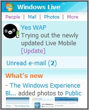
The Home page is the nerve center of Live Mobile, it’s where most of the activity happens, with the other core functions a click away.
At the top on the home page is a profile picture, and a “personal message” which can be used as a greeting or a social networking style status. If you have any unread emails, an alert will appear in a notification area below picture and personal message. Clicking the alert will open Hotmail. New Messenger IM’s do not generate an alert. It seems like Microsoft is really missing an opportunity to completely integrate Messenger into Live.
Next up is one of the core features of the new Live, the “What’s New“ feed which lists updates to your friend’s blogs, profiles, photos etc. 
Below the feed is a prominent text box where you can update your personal message at anytime. Placing the message update on the home page emphasizes that you are expected to use it as an ever changing status.
At the bottom of the home page are links to your Profile, and to the other Live mobile services; Hotmail, Spaces, Live Search and to MSN Mobile.
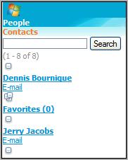
The People page is Live’s networking center.
People lists all your Hotmail and Messenger contacts and Spaces friends in a single list. There are links below each name to email, call or visit the Live profile of that person. Which links appear depend on what Live knows about that person. The Call link is shown only for contacts with a phone number, the Profile link only appears if the contact has a Live profile, etc. Again Messenger integration is missing, their are no “IM” links under your Messenger contacts, only an email or Profile link
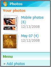
Photos is a rather basic photo sharing web app.
You can view your own photos and ones shared by people in your network. You can also comment on photos and download copies to your phone. The Photos page has its own version of the “What’s New” feed, which is filtered to show only photo related events.
 With many phones, including most Symbian and Windows Mobile devices, you can upload photos directly from your mobile browser. The Opera Mini and UCWEB browsers can also upload photos on many Java feature phones. Or you can send photos to Live by email or MMS.
What’s missing from mobile photos is any sort of editing capability. Uploaded photos wind up in a folder labeled “Mobile Photos”. There is no way to rename folders or move photos to a folder using the mobile web site. It doesn’t seem to be possible to delete photos either. Particularly annoying is the fact that the Mobile Photos folder is automatically marked private and permissions can’t be changed from the mobile site. Editing functions are available on the full-web site but you can’t get there on mobile. Even full-web mobile browsers like Opera Mini, S60WebKit and UCWEB are redirected to the mobile site.
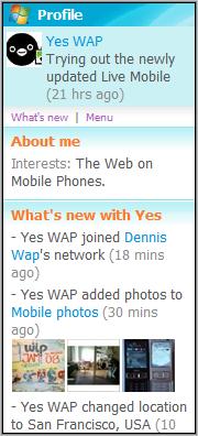
The mobile Profile page is a read-only display of the updates that you are contributing to the “What’s New” feed. There are also links to your Live photos and your Live Space. As with photos there are no management functions. Managing your Live persona including setting sharing permissions, adding services, etc., has to be performed using full-web Live site.
 On the full Live site, you can pick and and choose what you want to share with your network at a very granular level. Each of 16 built in data elements like profile updates and your guestbook can be public, private, shared with your entire network or with your extended network which includes friends of friends or only with specific people. The data you choose to share appears in the “What’s New” feeds of whoever you shared it with.
You can also share data external to Live, including a single Atom or RSS feed and a number of preconfigured web services like Twitter, Flickr, Photobucket, Pandora, Tripit and Yelp. By adding Twitter and your blog’s feed members of your network will see your Tweets and posts in their “What’s New” feeds.
Sharing is great but I’d also like to see the ability to add any number of external feeds that I could view on my Live Profile making it a personal portal in the manner of iGoogle. This isn’t officially supported by could be accomplished by adding a feed aggregator like Tumblr as your “Blog” feed and setting it to private.
My overall impression of Live Mobile is good. I’m not sure I understand Microsoft’s strategy however. As I mentioned earlier the new Live duplicates many of the features of Spaces. To me it would have made more sense to upgrade Spaces which already has 30 million users. Although Spaces isn’t being eliminated it does seem likely to be neglected given all the emphasis Microsoft is putting on the new Live. It’s hard enough to keep innovating and generating buzz around one social network, let alone two. I don’t think even Microsoft can spread itself that thin. Is the plan is to eventually migrate existing Spaces users to Live?
Usability is generally quite good although I’d like to see access key accelerators on menu items. Mobile Spaces and MSN have access keys, why not Live?. They cost nothing and really speed up navigation on non-touchscreen phones.
The biggest disappointment for me is that you really can’t set up and maintain a Live profile without a PC. What does that say to the hundreds of millions of mobile web users around the world for whom the mobile is their only way to access the web? Hopefully Microsoft will quickly add mobile management features to Live.
Source: Windows Live Blog Via: Mobile Industry Review
Filed in: Wap Review Directory – Portals/WAP
Ratings: Content: ![]()
![]()
![]()
![]()
![]() Usability:
Usability: ![]()
![]()
![]()
![]()
![]()
Mobile Link: mobile.live.com
I need it!