I’ve been using the Opera Mini 4 Beta as my primary mobile browser lately. I have no problem putting up with its minor rendering issues and propensity to lose cookies because it loads pages much faster than version 3.1 and is just as stable.
 One thing I noticed though was that the mobile version of this blog didn’t work very well in Mini 4. Many pages required horizontal scrolling which I absolutely hate. Although I ‘d chosen the “Fit to Width” option in Opera’s setting page, when viewing WapReview.mobi and some other sites like Yelp.com and ContentBlogger my “Fit to Width” request was being ignored.
DevOpera.com has a document for web designers with a great explanation of how Opera Mini 4 works and how to design pages that look good in it. But reading that document did not tell me why “Fit to Width” didn’t work on my site
The mobile version of this blog was originally written to work with the embedded browsers of mass market phones. That meant splitting pages and reducing image sizes to keep each screen under 10 KB of text plus at most 10 KB of images. It’s a “one size fits all” design so the resized images are quite small, no more than 90 px wide so they fit on even the smallest of phone screens. I also specified the CSS as “media=’all, handheld'”. This shouldn’t really do anything as “all” includes handheld but I was hoping having “handheld” in there would be a clue to search engines and browsers that this was a mobile site.
Later I added some code to detect Opera Mini and deliver a sightly modified version to it. All I changed to was turn off page splitting and image resizing. That worked great with Opera Mini through version 3.1 which could handle pages of unlimited size and resize images to fit any phone’s screen.
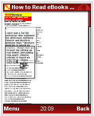
Opera Mini 4 is a complete rewrite which many improvements in rendering. It defaults to “Desktop Mode” where sites are displayed with the same layout they have in a desktop browser. For most pages the initial view is zoomed way out so the whole page fits the screen but with text that’s too small to read (top image). Pressing the center OK button or the 5 key zooms into “keyhole” mode where you can scroll around and see a small part of the screen with full formatting and normal sized fonts.
To me, Opera’s Desktop Mode is a very cool programming tour de force that is useful for studying the real layout of pages and is especially great for zooming in to see a detail in an image. It’s much nicer than the cumbersome image zoom in 3.1 which makes you view one segment of the image at a time with no way to scroll to adjacent areas. But for actually reading web content quickly and efficiently I much prefer Fit to Width mode and have selected it as my default. I found it disconcerting that Opera loaded some sites, including my own, in Desktop Mode and refused to switch to “Fit to Width” mode. I decided to find a workaround.
Experimenting with my site I discovered that it was the “media=’all, handheld'” on the style sheet that was disabling Fit to Width mode. With a handheld style sheet or even a single “@media handheld” line in any style sheet, Opera ignores the fact that the user specified “Fit to Width” in the settings. Even if you try to force “Fit to Width” using the context menu on the “1” key, Opera just reloads the page – still in Desktop Mode. I don’t really think this the correct behavior. If a user chooses “Fit to Width” Opera should respect that choice. Many desktop sites label their printer style sheets as “printer, handheld”. Who’s to say that’s wrong? The “printer” style probably does work better on a small screen than the “screen” style. Just because the page designer specified a handheld media type doesn’t mean the page really is a handheld friendly page or that the user doesn’t want it fit to screen width. Opera Mini 4 is a beta so this will hopefully be changed before the final release.
For pages with a handheld style sheet and no “really large” images, Opera Mini 4 will display the page with full size images and fonts but won’t go into the zoomed out overview. If images are wider than the screen, horizontal scrolling will be required, of course. If a page has images over a certain size, ( 329 px wide on my phone which has a 176 px wide screen),  Opera will show the page fully zoomed out with text too small too read.
Removing the handheld media-type from WapReview.mobi’s style sheet finally made it possible to choose Fit to Width. That was OK but I wondered if there wasn’t a way to modify the site so it always displayed with images that fit without the user having to explicitly select fit to width mode. At first I though I’d need to do a lot of work to resize the images on my server or use something inefficient like JavaScript to resize images in the onload event or maybe include multiple different sized copies of each image on the page and show and hide them based on Media Queries. But it’s actually really easy to do using some simple CSS. Just add this to your style sheet:
img {
max-width:100%;
height:auto;
float:none;
}
The “height:auto” makes it work even if your images have height and width attributes – as they should. “float:none” overrules any “align=’left'” or “align=’right'” attributes on images. If you are using CSS floats on your large images, you might have to change the last line to “float:none !important”
Please understand that I’m not recommending sending images wider than the screen to any browser except Opera Mini. That would cause the large image to be downloaded to the phone over the (usually) slow mobile network and resized using the phone’s (usually) slow processor . Not something you want to subject your users to. This hack only works with Opera Mini because the resizing occurs on Opera’s server. In addition, other than Opera, I don’t think any mobile browsers even support max-width.
Pingback: Css for mobile phones « Rebecca Farrell
Hi Dennis – Chris Mills here from Opera. I’d be glad to help you out with this issue – it should be possible to get Mini 4 to behave in this context. Have you tried using a media query to check if it is a handheld, and then if so specifying a max-width lower than the maximum screen resolution, so the site is never able to get bigger than the screen, and therefore forced out to zoom mode? I may be misunderstanding the situation, but this is what sounds likely to me.
Feel free to drop me a mail about this.
all the best!
I have Nokia N73 mobile. After reading many good reviews about Opera mini I decided to download it on my phone. Somehow Opera mini seems to be having problems with this phone. Initially I had problems installing it, now after several attempts I managed to install but I am really disappointed with the performance, it is very slow when compared to the internal phone browser. It frequently hangs and I have to forcefully close the application.
After many unsuccessful attempts to use it as my main browser, I had to quit in favor of the internal phone browser.