It’s been “coming soon” for the better part of a year but the English language version of China’s UC Browser for Android landed earlier this week. Was it worth the wait? Only you can decide but read on for my impressions of the newest Android browser.
UC Browser (formerly UCWEB) is a proxy based browser like Opera Mini, Bolt and the Symbian and WinMo versions of Skyfire. It renders, reformats and compresses web pages on a UC server before sending them to the device. The rendering engine is UC’s own rather than Webkit or Gecko like Bolt and Skyfire respectively.
If you’ve used UC on any of the other platforms it supports (Java ME, Symbian, WinMo, jailbroken iPhone) you will feel right at home with the Android version.
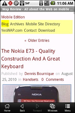
On Android UC has the fit-to-width “Adaptive” (image, top left) and desktop “Zoom (Compressed)” (images, bottom) modes found in UC on all platforms There is also a, unique to Android, uncompressed or direct Zoom mode that uses the Android WebKit rendering engine. In the direct mode pages look great, just like they do the Android native browser. However, direct mode uses the UC menu system rather than Android’s. This has the advantage of consistency but in return you give up some major Android features like geolocation support and easy one click sharing of pages with email, Bluetooth, Twitter, Delicious, Facebook and other web services.
Here’s what I like and don’t like about UC on Android.
The Good:
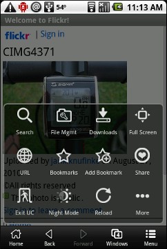
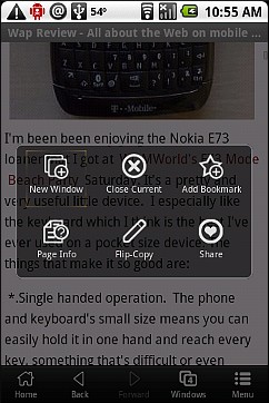
For touch based Android, UC has created a new simplified, slick and finger friendly menu structure. There’s a flat two page main menu (image top, right) as well as context menus (image above, right) that are invoked with a long press on the screen or a link. I’m hoping that this new UI gets ported to UC’s Java version, where the tiny text links in menus are very difficult to use on touch only phones without a trackball or cursor keys like the Samsung Wave.
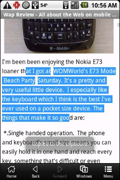
This is also the first version of UC that I’ve seen that lets you copy text directly from a web page. UC calls this feature “Flip-Copy”. To use it, do a long press on the screen and choose “Flip-Copy” from the context menu. Then drag to select text. When you lift your finger the selected text is copied to the system clipboard. It works, but I wish there was an option to select with the trackball like there is with Opera Mini, as my fat finger tends to hide the selected text making accurate selection difficult
I didn’t do any speed tests, but page loads, especially in Adaptive mode, are snappy. I got the impression that UC is loading pages even faster than Opera Mini on Android.
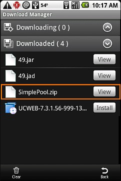
A UC strong point is the best download manager in any mobile browser (image below, left). It allows you to download any file type and supports suspend, resume and background downloads of multiple files.
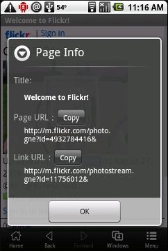
Another plus is a context menu item that lets you easily copy the URL of the current page, link or image (image below, right).
The Bad:
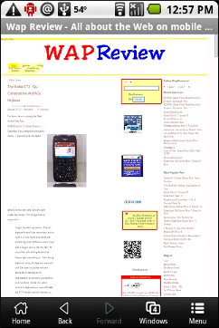
Rendering in UC’s own modes, while it gets better with every release, is still a weak point. Among UC’s quirks, it tends to double space text where it’s not double spaced in the original page (image bottom, right) and it will wrap lines at apostrophes so that contractions like “don’t” are sometimes split across two lines. It often omits a space before a links and adds an extra space after them. Transparent GIFs display badly, with missing parts and background artifacts. In zoom mode images are sometimes tiled when they are not supposed to be (image below, left). These are all cosmetic issues that don’t seriously affect usability. But if you’re picky about how pages look you probably should use a different browser.
For the last year UC has had some ongoing server issues that affect the browser on all platforms. On many popular sites, there were log in problems or pages would come up blank or the browser would display an error rather than loading a page. The vendor is aware of these problems and recently has made some tremendous strides lately in getting the servers to work with most sites. I find that I can now reliably log into Twitter, Facebook and Gmail, all of which used to be problematic. There’s still some work to be done though. Loging into Yahoo still fails and using OAuth to log into third party Twitter clients is hit or miss. Cookie handling is a bit problematic too forcing me to re-login to some sites every time I visit and sometimes in the middle of a session.
UC doesn’t support bookmarklets or Android’s built in Share feature which lets you pass a page’s URL and title to other apps and web services. Every day I share multiple links on Delicious and Twitter so this is a big deal for me.
The Verdict:
I’m glad to see UC supporting Android. I hope that they continue to enhance the Android version and work on the server issues. I like UC’s speed, download manager, easy of copying URLs and links and that its fit to width mode actually works on all sites, unlike Opera Mini’s. But the site compatibility and cookie issues and especially the lack of bookmarklet support are show stoppers for me. If UC can fix those I’ll be a convert for sure.

Related Posts:
UC Browser’s “Blank Screen” Bug Fixed
Official English UCWEB 7.0 Browser Reviewed – Great Feature Set But Many Sites Fail To Load
UCWEB Android Version Found!
UC Browser Version 7 Beta 2 Is Much Improved – But Popular Sites Are Blocked By The “Great Firewall”
Speed Test – Opera Mini, Bolt, Skyfire and UCWEB
New UCWEB 6.6 Beta
UCWEB 6.5 English Beta
UCWEB 6.3 Official Signed English Version Released for S60
Official Release of UCWEB 6.3 For Java ME
Good
I was surprised that they changed the tab system in the Android build. It now mimics mobile Safari and Skyfire on Android. I remember using the touch version of UC Browser on the N97 some time ago and it had the traditional tab bar above the webpage like the non-touch builds. I would have prefer that over the new implementation. The new system just doesn’t work well with how I use & manage tabs.
X-scope browser on Android has a tab system very similar to the old builds of UCWEB. It probably has the best tab implementation of any browser on android that I’ve tried. It has an always present tab bar above the page when two or more tabs are open. You can open and close tabs easily by clicking on the tab. And best of all, holding a link will automatically open the link in the background in a new tab.
Maybe I’ve been spoiled after using the non-touch version of UCWEB for so long on my s60 phone, but I came alway fairly disappointed with this new built for Android. Several features got lost in its transition to touch that made UCWEB such a great and functional browser. You lose both custom keypad shortcuts and a tab system that still beats all other mobile browsers I’ve tried.
I’m not sure if this is the same with you but version 6.3 released how long ago is still the highlight UCWEB releases. Everything released since than hasn’t quite matched it. And oddly enough, most of the cookie and server issues that has plague newer 7.x international releases rarely occur on the older v6.3 builds. Strange.
I agree that touch is not always better. One thing you give up is keyboard shortcuts as there are no keys. UC Browser on Android does have tabs and it’s easy enough to switch between them by taping the “Windows” icon and then taping the window you want.