I do most of my casual web surfing on my phone. The PC is primarily for work; writing code and prose, editing images, etc. The phone is where I catch up with the news and skip from link to link exploring new topics, sites and authors.
Usually my mobile surfing starts with a link in Twitter or Google reader. Most of the time it works. But about once a week I click on a link to a story and it takes me to an error page or a news site or blog’s mobile home page with the article I wanted to read nowhere to be found.
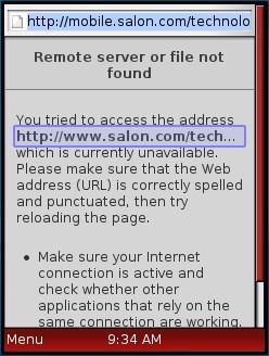
It happened again today. I clicked a short link on Twitter to read what I though was going to be an op-ed piece on the tragic Moscow airport bombing and got a ‘file not found error’. It turned out that the short link was to a recent item on Salon.com. The link worked perfectly in my PC browser but when I tried to follow the same link on my mobile, the site’s browser detection redirected me to an “m.” version of the same story, which doesn’t exist for some reason.
I played around with Salon’s mobile and desktop sites and found a couple more deep links that gave errors in my mobile browser, although the vast majority worked fine. I’ll rack this one up to random bug somewhere in Salon’s infrastructure that breaks the odd page now and then.
Links, including deep links, are the glue of the Internet. With more and more browsing occurring on mobile devices it’s important for publishers and designers to make sure that a link or bookmark from one device works on all devices.
The W3C calls this principle “Thematic Consistency” which they define as:
“Thematic consistency does not mean that the content has to match exactly. It means that, as far as is reasonable:
- the information provided by the resource should be the same
- the color, the logos, the layout of the content should be close
- the functionality on different devices should be similar
In short, it means that users who switch from one device to another should not have to wonder: “Where is this piece of information I’m looking for? I know it’s there, I saw it on my laptop!” A single glance at the different versions should be enough to say “OK, that’s the same thing”.
I don’t always agree with the W3C but they got this one right. Don’t redirect a request for a specific page to the mobile home page or a nag page telling the user to visit the site with their PC. If the resource isn’t available in a mobile formatted version, serve the mobile user the desktop page, most modern browsers can handle just about any page. An increasing number can even deal with Flash.
i switched from symbian to android and this problem improved greatly…
Pingback: Tweets that mention Don’t Let Thematic Inconsistency Bite Your Mobile Users | Wap Review -- Topsy.com
I’m not great at coming up with pithy phrases, but I am happy with this goal:
“The URL works.”
Expanded:
The URL works on any device and from any source, whether it be a web page, email, landing page, ad, URL shortener, widget, bookmarking system, or social media platform. The URL delivers the content the person saving the link thought it does.
Another violator in a slightly different context: saving links using RSS readers where the RSS feeds come from Feedburner. I think I am saving a link to the article, but the title comes up as Feedburner or something else equally useless.
The URL works – I like it.
I don’t remember having any problems with Feedburner links. The links do look funny feedproxy.google.com/~/something/~3/somthing but seem to work OK for me when copied into mobile browsers. I wonder what the use case is that causes them to fail. If there’s a problem I need to stop using Feedburner for my blogs which my poor, capacity challenged shared hosting plan isn’t going to like.