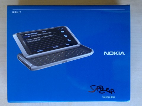
I received a Nokia E7 for review yesterday from WOMWorld/Nokia. I’ve been looking forward to some extensive hands on with this phone since I first saw it at Tech.Ed in Berlin last October.
I got quite a surprise when I ripped off the wrapping and saw the box’s custom slip wrapper. It looked like regular Nokia packaging with an image of the E7 on the front. But the phone’s screen was displaying a Tweet I sent from Tech.Ed “First hands on with #E7 at #tee10″ Amazing device, especially the keyboard“. And the box was signed by the man himself, Nokia CEO Stephen Elop.
I haven’t had much much time to explore the phone yet but I wanted to post a couple of photos and my initial impressions.
The E7 hardware is sleek and sexy with an exterior made almost entirely of metal and a big, bright 4 inch screen. I especially impressed by how thin the E7 is. At 13.6 mm I believe it’s the thinest QWERTY slider phone currently available. It’s thinner than many pure touch phones including its N8 stablemate when you take the later’s protruding camera housing into account.
The keyboard sliding mechanism is impressive. Opening it takes a bit of pressure initially which keeps it from being opened inadvertently. But once you have moved it about a quarter inch (6 mm) a spring takes over and the screen pops smoothly up into it’s opened position with a reassuring “Whumff”.
The keyboard itself is very good, with large, well spaced keys that are slightly raised with a fair amount of travel and a positive feel. There isn’t a dedicated number row but a long press on any key will enter the alternate number or symbol character on it. The keyboard has four directional keys for controlling the text cursor. Those keys are quite handy when editing longer documents.
Every time I get a new Nokia device I’m delighted with the built in data transfer app. It’s simple, intuitive and always seems to work the first time. It took me all of five minutes to copy all my contacts, appointments, bookmarks, notes, texts and call history from my N8 to the E7 using Bluetooth.
The browser appears to be identical with the one on the N8, which unfortunately is very dated. I like it for a few sites like Google Reader in single column “Wii view“, but I find it too slow and lacking in features for general use. There’s supposed to be an improved browser coming in the next Symbian^3 firmware upgrade.
For now I’m using the native Symbian version of Opera Mini 5.1 as my main browser on the E7 and am happy to report that it works very well. I haven’t found any key mapping issues using Opera Mini with the E7’s hardware QWERTY keyboard. A double press on the Alt key locks the keyboard into number and symbols mode and all of Opera’s handy shortcut keys for page up and down, toggling full screen or mobile view on and off and launching Speed Dial links work as expected. A single press of Alt disables symbol mode when you want to enter text. Using the E7’s directional keys to steer Opera Mini’s mouse cursor and the enter key to toggle its (way too small for touch screens) radio buttons and check boxes works great, much better than trying to use your finger.
That’s about all the exploring I’ve done with the E7 so far but I promise I’ll be back with more on what at first blush seems to be a very promising device.


Thanks for the review – looking forward to hearing more about your experience with this phone.
It seems like a great one but with all of them there are always things we’d like to see it do better or faster.
How was the UI – easy and clean?
Thanks,
Gus
On the Dutch launch of the E7 , Nokia employees suggested 3 (major) updates for Symbian ^3 to come in 2011 . One with the new Webbrowser and also a new UI .
:) Regards jApi NL